How PODs Compensate Designers And How Things Have Changed Over the Years.

Posted by Mongo

Back in 2010, Cafepress decided that they were going to change how they compensated their designers.   Instead of receiving your predetermined royalty on any of your designs, any sales you made from your products found in the marketplace (i.e. general searching from Cafepress’ homepage) would default to an across the board 10% commission.   This basically destroyed the community of designers that depended on their regular markup as income and caused a massive jumping of ship from Cafepress.   Cafepress neither folded nor deviated from that decision in the last three years.

Principles would force me to show solidarity and flee Cafepress.  However, the fact that, out of all of my Print on Demand shops, Cafepress comprised 50% of my total revenue I just couldn’t.   Yes, it was a hassle.  It still is.  I cannot lower my standard markup to compete against the base prices in the marketplace which tells me that Cafepress charges the designers MORE for the base price of the items they sell in the marketplace.   If you need any further proof, look at this.

This is the general marketplace search of one of my ringer shirts, Amity Island Swim Club.
The marketplace price is $14.99.  Buying this shirt will generate a commission of $1.49 for me, the designer.


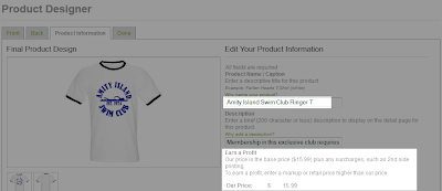
Now, here is the same shirt in my product designer.  This is where I decide what the name and description is, as well as the markup.  As you can see, I haven’t even added a markup yet and it’s already a dollar more than if you bought it in the marketplace.     

 
That $15.99 base price is what it would cost me to buy the shirt if I bought my own work and wanted to use my CafePress earnings to pay for it.   So, as an added bonus, designers might want to think about using other funds to buy their own works and you can even generate a 10% discount in royalties for the sale.

Like I said, 50% of my earnings from shirts come from CafePress, so I bite my tongue and stick with it.


Now, Zazzle is either feeling the pinch of the economy or they have decided to just cut overhead.   It was recently announced that, one, prices for products were going to increase due to inflation and, two, the structure for our volume bonuses were going to change drastically.

The way the volume bonus worked was that for every non-referred sale of your work, meaning someone found it on Zazzle and were not referred by a third party, you earned a bonus of 7% of the total base price sales over $100.    To clarify, in any given month, if you sold over $100 in designs, excluding your markup, for every dollar over $100, you got a bonus of $0.07 cents.   The tiers increased in percentage as you went up.   Let me tell you, at Christmas time, I earned an additional $150 in extra cash due to the increase in sales in the month of December.

As of July first, though, the structure has changed.  You only make extra money with referring people to Zazzle.  That means that other people make extra money off your sales, not you, anymore.  If you refer others to buy stuff on Zazzle, they calculate a bonus after $100 in base sales.  That first tier is 1% up to $999.  So, if you manage to refer enough sales to make $999, you get $9.99 in bonus payout.  5% for sales between $1000 and $4999.    So, if you are good at referring and social media you can make more money than a designer can.   

Now, I do not have a problem with others making referral money off my work.  I’m all for it.  But the old way was better for everybody.  Referral sales used to net folks 15% of the sale.  Now, it's the same tier as us designers on referrals.

Also, it used to be that when you set a markup on your products there was no service penalty for markups between 10% and 20%.   That, too has changed.  While they reduced the minimum markup to 5% they enacted a “transaction fee” of 5% for designers who marked up their work 15% and higher.    So, while Zazzlers get a better shake of the deal with take home royalties than CafePress users, we are now being punished for pricing our work at the lower end of what we really feel it should be worth. 

As of writing this, I see no new restrictions, changes, or screwing overs being perpetrated by Skreened and Redbubble, my two other stores.   I am confident in them and they have been a higher quality of companies to work with in the long run.  While I do not make as much through their sites, (volume not royalty amounts), I am happy to continue hosting my work with them.  Well, let’s face it, I am still going to sell my work on CafePress and Zazzle, but if you haven’t noticed lately, I have been pushing Skreened and Redbubble designs more and more due to the shenanigans at the Walmart and Target of Print on Demand sites.   Reason being is that they are higher in customer service and materials, and quite frankly I would rather people buy my stuff with them than with the other two.  They obviously do not need my help.
  • So, what are your horror stories or gripes with Print On Demand publishing?
  • Have you made the jump to being independent?
  • What are ways to help those of us still relying on other companies to do the heavy lifting?

So, You Want To Be A YouTuber

Posted by Mongo


Why not?  Don’t we all just have that need to be gawked at and make silly noises and faces?  Sometimes, it just happens all on its own.

Really, this is now a thing.   And I wanted to update you on how it’s going. 

It’s fun.  It’s work.  It’s a pain in the ass some days, but, I still enjoy it.

Sorry, my thoughts are a bit all over the place as I try and figure out exactly what to cram into this one post.

  1. The Regular Stuff - I haven’t forgotten to dance with the one that brought me.

    I still do shirts.  I still blog.  I still care.  I just have been really busy at slacking off and doing other work.  It’s been hard to budget my time between my ninetofiver, my family, my shirts, and YouTube.  Since it’s the newest thing, I needed to put some work into it, so I can hopefully let it ride some on auto-pilot.
  2. Rants/Vlogs – In an effort to report to all of you how I’m doing and to give you tips and advice for better… You…Tubing(?)  I am going to record a series of posts I shall call RANTS.  These will be me talking about everything about the business and the pitfalls, the successes, the heartbreaks, and everything. 

    Again, I did most of this on my own, and while I have had an AMAZING amount of help from others in the online community of designers, I am still finding out on my own how to do things and want to share with you so that you can know what you should think about if you wanted to do any of this stuff.

    Now, of course, the videos will be of me probably playing games or other stuff.  I just don’t have the confidence of putting my big old ugly mug up on YouTube.  It’s hard enough for me to make sentences… and grammar.  So, deal with it.
     
  3. Space – One thing I will share, now is that if you are considering doing YouTube videos as a side gig or career, be prepared to become a digital hoarder.

    I started out in January with nearly 700gb of hard drive space on my lap top and this month I had to purchase a 1 terabyte external drive to make room.  And… it’s filled.  So, is my laptop, again.  Being the cheap ass lazy entrepreneur, I am trying to keep my costs in check.

    Since I am not making any money on YouTube, as of yet, I cannot keep sinking money into something without an ROI.   So, I either need to get more viewers/subscribers or pull the plug.   What?  Did you expect me to actually throw away all the countless hours of gem filled commentary while I dig a hole or build a city?  That was sarcasm.   In all actuality, I probably need to just not suck in my videos and I’d probably get more views.  YouTube is a vast and huge abyss of videos.  I’m in there somewhere.  You can help by supporting me and I will love you for it in a non-committal / non creepy way that doesn’t result in restraining orders and regret.
     
  4. Finally -  CHECK ME OUT  http://www.youtube.com/TheAngryCast   I promise to write more.  I’ll call.  I’ll text.  I want to make this work between us.  I just need to find out who I am and be comfortable with that.  ;)
     
  5. Oh and yeah, one more thing,   MONGO SMASH!

The Westeros League: The Dreadfort Boltons

Posted by Mongo

Sorry for the delay on posting this.   I’ve been busy adding more spinning plates.  I launched a YouTube Channel, which is mostly me gaming… and failing, but more importantly, it will give me a chance to share some of the designs with the gloriousness that is my voice.  Kidding.  I fully intend to do a bit on The Westeros League before season 3 bows.

With that in mind, the last addition to the league is now here to capture your hearts… or at least flay your skin.

 My Design It - The Dreadfort Boltons Video

The Dreadfort Boltons
Not much can be said without giving too much away.  In what promises to be the “Snake in the mailbox” moment for season 3, the Boltons, not the no talent ass clown that shares the name with an employee at Initech, play a big part in the events in Westeros.

Not knowing a lot about them, because I’m a scrub and haven’t read the books, I had to rely solely upon the wikis to glean what I could.  The Boltons sigil is that of a flayed man.  Now, as I try to keep the designs PG, it’s hard to display a man without skin prominently on the front of a shirt.    I almost went with a backup plan of doing the design as a red carnation, dripping blood.   However, inspiration came from another team with an almost blood soaked theme.   Who can forget the end to the curse of the Bambino and  the Boston Red Sox in 2004, complete with Curt Schilling’s bloody sock?  That sight made me come back around to displaying the flayed man, but as a silhouette, almost mimicking the dangling red socks.  The lettering for the team and their home seat of Dreadfort is similar to said Beantown ballers.  Finishing the look is the motto, “Our blades are sharp.”

The Dreadfort Boltons is available from my stores, now.


The Dreadfort Boltons
 Available from Skreened and Redbubble.


Black American Apparel Unisex fitted tee from Skreened: $27.99


Black T-Shirt from Redbubble: $24.54

3/4 white sleeve on black baseball shirt from Redbubble: $27.54


Black Zipper Hoodie from Redbubble: $50.40

Sticker from Redbubble: $2.40


iPhone 5 Deflector Case from Redbubble: $37.20

 iPad (Retina) Deflector Case from Redbubble: $63.90


You can check out all of the Westeros League designs at Skreened and Redbubble.
Look out for a video walk through of each design, coming soon.


The Westeros League: The Evenfall Hall Tarths

Posted by Mongo

Well, I did it, again.  I wasn't content with leaving the league at 14 teams, so I expanded.  We now have 16 teams in the league.  The two new teams should be pretty prominent in Season 3.  The first is based on a popular character from the last half of Season 2 and is currently traipsing through the countryside with a Lannister in tow.   That is, of course, Brienne, the Maiden of Tarth.

 Check out the Design It Video for
The Evenfall Hall Tarths

The huge Nordic-like woman who plays Brienne has gained quite a following since donning an awkwardly mobile suit of armor and has even spawned a fan made parody Rom-Com trailer.


The only thing this is missing is a Natalie Imbruglia or Cranberries song in it.  But... still a better love story that Twilight.  LOL

So, on with it.  

It was hard to not do this design in the vein of rugby or football (what us Yanks call soccer) team logos.  After all, the sigil for The Tarths is their crest with a sun and moon against offsetting colors.  However, being that we are always treated to Gwendoline Christie tromping around in that suit of armor like she's going to fall over, I thought her helm would be a nice addition.  

Building off the colors from the wiki page, I set that against a shield.   It doesn't have that traditional American professional sports feel.  Let's face it, I can't draw, and there aren't a lot of pro teams with a shield or a knight as their logo unless you dig into the minor leagues or college ranks.  New Orleans is the only one with a sort of crest and I already went to that well for the Tyrell's.

I hemmed and hawed over dropping the beaver (the part that covers the face, ya sickos) down over the name area and outlining it with a little white to break it up from the black background.  I guess, in hindsight, using black on that area was a bad idea.  The colors for the design needed to retain the crest and shield coloring, as seen on the wiki page and in the first scene of Brienne fighting for the chance to be Renly's guard.  The armor color needed to make it in there somehow and overall, I think all the colors work together.  The crossed swords were just an added way to cover up some canvas space. 
The Evenfall Hall Tarths is available from my stores, now.

The Evenfall Hall Tarths
Available from Skreened and Redbubble


Black American Apparel Unisex Tank from Skreened: $28.99


Heather Grey T-Shirt from Redbubble: $24.54

Dark Grey Pullover Hoodie from Redbubble: $47.40


Sticker from Redbubble: $2.40


iPhone 5 Deflector Case from Redbubble: $37.20

 iPad (Retina) Deflector Case from Redbubble: $63.90


You can check out all of the Westeros League designs at Skreened and Redbubble.  The second addition will be up soon.  Also, look out for a video walk through of each design, coming soon.