The Westeros League Designs

Posted by Mongo

Over the past couple of weeks, I've been putting together a post for each team design. The first four teams got a fictional report of how their seasons were going.  That become cumbersome and I scrapped it for a straight forward approach.  So, beyond the Baratheons, Greyjoys, Starks, and Lannisters, it's more about what inspired me, the approach, obstacles, and talking points.

Included in each post is a larger version of the design and links to the stores and different products they adorn.  For now, I only have them on Redbubble and Skreened.  At Skreened, they are available as t-shirts or hoodies.  Redbubble has a wider selection including shirts, hoodies, stickers, iPhone cases and soon to be iPad cases as well. 

The giveaway will be coming shortly as I continue to gather up all the prizes for it.   Stay tuned and enjoy.


The Westeros League: The Cape Wrath Seaworths

Posted by Mongo

We’ve finally reached the end of the league.  The last design is up and it’s one of my favorites just because of the hilarity of how it came up during the show.

Davos Seaworth has had a hard life.  He’s down a couple digits and was witness to the biggest “WTF” of the series so far, the vagina wraith.  Seriously, when I saw that I was like, “DAFUQ!?!?”

But Davos’ most hilarious tale was how he flies the flag of an onion on his ship.  That alone made his inclusion into the league a definite.  But… how do I bring an onion design to life in a league of animals, people, and flowers?

I tried to do this as a ship design, much like his sigil image from the Wiki of Ice and Fire entry.  
  
However, the design of the ship overshadowed the onion, dwarfing it.   Then, I went back and looked over the professional logos for some inspiration and it was obvious where I should go for the design,  The Tampa Bay Buccaneers. 

I took the Bucs design and used it as a guide.  I didn’t make it as tattered since the colors would blend and it be hard to see.  Instead of the cutlass holding up the flag, I went with a bastard sword, much like the Rangers’ design had.  For the text, I went with a less Tiki looking font and more of a pirate-y shredded one, maintaining a likeness to the Buccaneers’ logo.   As for the Skull and Cross Bones from Tampa Bay’s flag, I ditched the idea of including my own with an onion in the place of a football.  The onion here suffered the same fate as the original intention to use a ship for the design.  Instead, I left the onion front and center in the middle of the flag.  I did keep the black and grey coloring, even though I already had several ones using those colors.  

In the end, I was extremely happy with the overall design and it still makes me giggle every time I see it.  Then, I think, “vagina wraith” and I’m in a fetal position on the floor.

That concludes the designs in the Westeros League.  I hope you enjoyed these posts as much as I enjoyed creating the designs.  Stay tuned for a giveaway coming up in the near future.

The Cape Wrath Seaworth’s is available from my stores, now.

The Cape Wrath Seaworths
Available from Skreened and Redbubble


Smoke Anvil Unisex T-Shirt from Skreened: $26.99


Black T-Shirt from Redbubble: $24.54


Pullover Hoodie from Redbubble: $47.40


Sticker from Redbubble: $2.40


iPhone 4S/4 Deflector Case from Redbubble: $37.20


You can check out all of the Westeros League designs at Skreened and Redbubble.


The Westeros League: Clegane's Keep Mountain Hounds

Posted by Mongo

We only have two designs left to showcase and they were alternates.

I say alternate because they are sort of done with tongue in cheek.   Most people will not get them unless they are familiar with the source material of the books and shows.  In fact, the only reason I did one was because I had to do the other out of sheer joy of bringing an onion into the mix.

The first is a hybrid of sorts.   Sandor and Gregor, the Clegane brothers feature prominently in the series.  In fact, my first huge “WTF” moment, other than the incest, was Gregor decapitating his horse at the joust tourney.  It was brutal because of how long it took.  Now, as evil as a person he may be, I still hold a bit of a soft spot for Sandor, but he has his own demons as well.

For the design I wanted to go in a different direction because the obvious problem was calling the team “Clegane’s Keep Cleganes”.  A friend stepped in and said that I did need to do this one and offered the idea of the Mountain Hounds as a sort of compromise.   That made it all the more easy to realize the design in full.

I tried to keep the  overall color scheme intact, though had to fudge a bit since the contrast of a dark focal point on a lighter background was muddying the design.  The text part was easy as I had no real basis for inspiration.  It did remind me of a racing team or a logo for a outdoorsy type store or brand, maybe even a beer.

The Clegane’s Keep Mountain Hands is available from my stores in the following:

The Clegane's Keep Mountain Hounds
Available on Redbubble and Skreened


American Apparel Lemon Unisex Fitted T-Shirt
from
Skreened: $29.99


Light Yellow T-Shirt from Redbubble: $24.54


White Hoodie from Redbubble: $43.20

Sticker from Redbubble: $2.40


iPhone 4S/4 Deflector Case from Redbubble: $37.20

You can check out all of the Westeros League designs at Skreened and Redbubble.

The Westeros League: The Frostfangs White Walkers

Posted by Mongo

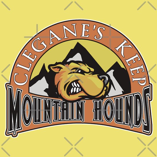
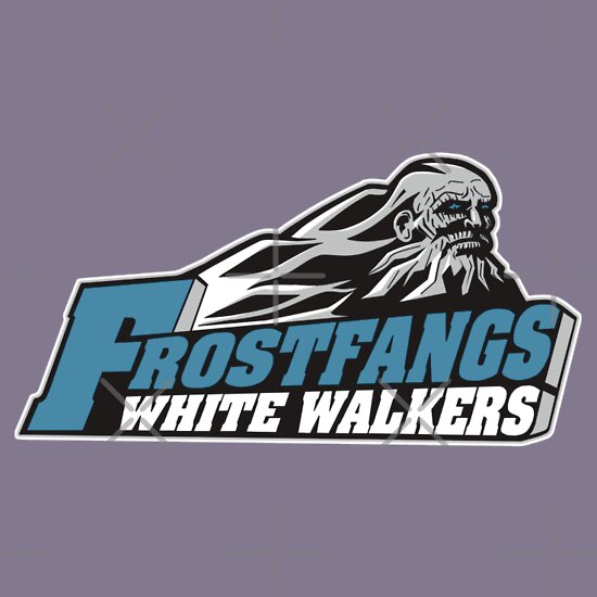
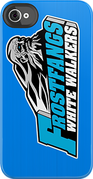
Rounding out the 12 main teams, I knew I had to include the White Walkers.  Question was… where do they reside?  I scoured over the Wiki of Ice and Fire and debated the idea, nearly scrapping it altogether.   I was going with Always Winter but was swayed by a good friend to use Frostfangs.

This was the one design where I really broke convention like the Night’s Watch Raiders.  I wanted to keep to a city and house name but having only seen the two seasons and not read any of the books, I was a bit lost in the Haunted Forest.

I finally settled on Frostfangs White Walkers.   I’ll admit the name didn’t roll off the tongue but thought if I could pull it off, it would be well received.  I’ll leave the judgment to you all.

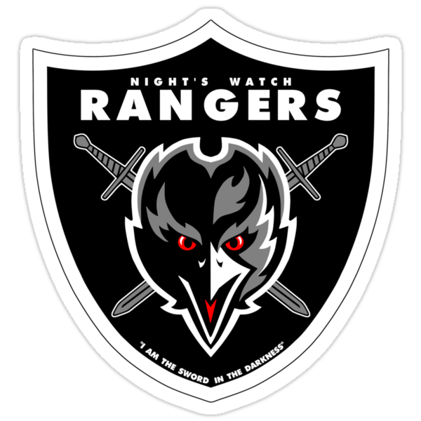
In coming up with the design, I wanted to do something different with the colors.  I already had a lot of silvers, grays, blacks, to go along with whites.  I knew that white was going to be a central color but had to offset the color somehow.  Grey was inevitable but what about another color.   The Rangers’ crow had those red eyes.  That was it… that frozen blue look in the eyes of the Others.  That was third color.  I tried to make it look like one of those arctic blue cough drops. 

Next was the hard part… the actual look of the design.  I did some searching and figured I needed something that looked like a soldier, pretty much a dead soldier, though.  I figured something akin to a Civil War style look.    It seems rather strange, but think of the leader of the Others as an old civil war soldier or mountain man.  That led me to a college team in West Virginia, the Appalachian Mountaineers. 

Its design was exactly where I was going in terms of ideas.  It had that ghostly man with a beard set against a mountain.   However, I knew that I needed to be more cracked and rigid with the lines as the leader of the Others had that very wrinkled and lined face.  So, I redrew the design, using the Mountaineers as a basis, but made the face hatless, more angular, added in some lines to the beard, and then expanded the mountains more to adapt to a hatless, nearly bald head. 

As I’ve found out over time, fonts for logos are rarely created, taking into account all the letters. In this case, no one font worked totally for all the letters in Frostfangs White Walkers, so I had to customize a few to capture the same feel as the Mountaineers logo.  The easiest part, considering the rest of the design, was the side wall of the team name.  In the Mountaineers logo, the "N" and "S" have breaks in the gray.  I decided to go solid, unlike the "S" in Tullys because it just looked better. 

When all was said and done I was proud of the work... it's still not 100% where I would have liked it, but I'm not going back and putting walkie talkies in over top of the guns. 

And with that, here's The Frostfangs White Walkers.

The Frostfangs White Walkers
Available from Skreened and Redbubble

Navy Anvil Unisex T-Shirt from Skreened: $25.99

Grey T-Shirt from Redbubble: $24.54


Dark Blue Hoodie from Redbubble: $47.40

Sticker from Redbubble: $2.40

iPhone 4S/4 Deflector Case from Redbubble: $37.20

As always, you can check out the entire line of designs at my Redbubble and Skreened stores.

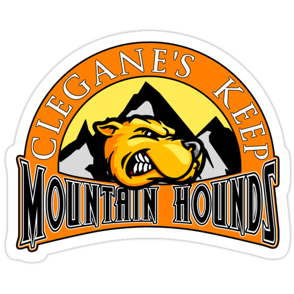
Footnote:  Here's the original inspiration for the design.  I've began putting this at the end because when I post it to Facebook, it tends to pull the first picture which is usually an actual sports team logo... ruining the effect of sharing the post.


The Westeros League: The Night's Watch Rangers

Posted by Mongo

Continuing the Westeros League design posts with the Night's Watch Rangers.

They are the last defense against the monsters beyond the Wall.  Up at the end of the world, they are the sword in the darkness.   Over two seasons they've trained and froze and waited for the chance to keep the things that go bump in the night away from the lands to the South.  In season 2, we saw exactly what they are going to be up against as a horde of White Walkers came marching towards the gate.

OK, the Night's Watch had to be included.  But deciding how to figure this one out took some time and head scratching.  There isn't really a city associated with those at the Wall.  I couldn't decide what to even call the team.  Do I call them the Crows, because there isn't a family name associated.  Eventually, I settled on Night's Watch Rangers but still didn't have a masoct, so I went with the crows as they are sometimes called.

The immediate inspiration was The Oakland Raiders due to the difference of only two letters.  I based the overall design on the logo of the Raiders but substituted a bird for a Raider and used the Bastard Swords instead of the Cutlass.  Since there is no real house for the Wall, I went with the Raiders colors, using a small amount of red for the eyes and tongue of the crow.  The last addition was putting in the motto of "I am the sword in the darkness."

You can find the Night's Watch Rangers in my stores:

The Night's Watch Rangers
available from Skreened and Redbubble


Black Unisex Fitted Tee from Skreened: $29.99


Black T-Shirt from Redbubble: $24.54


Heather Grey Hoodie from Redbubble: $47.40


Sticker from Redbubble: $2.40

iPhone 4S/4 Deflector Case from Redbubble: $37.20


See all of the Westeros League designs at Skreened and Redbubble.

The Westeros League: The Valyria Targaryens

Posted by Mongo

As we continue looking at the desgins of the Westeros League, we get into the real fun ones.  Up next, the Valyria Targaryens.


Watch My Design It video for
The Valyria Targaryens

This was an important team to bring to life.  It is the fourth storyline that plays out across the first two seasons.  While the Baratheons fight the Baratheons/Lannisters and the Night's Watch venture North of the Wall, the Targaryens and the Dothraki make their way to the Narrow Sea and get ready to attack King's Landing.   Daenerys totes along her three dragon babies and encounters court assassins and the mysterious people of Qarth.

According to the wiki, the sigil for the Targaryens is a three headed dragon, representing the three dragons that were rode into battle by Aegon and his sisters.  Their colors are black and red. 

Now, I had a few options in the design to consider.   The ancestal home of Valyria or Dragonstone could represent the city of the team, then again, they reigned in King's Landing for 300 years.  In the end, I went with the ancestral home of Valyria.  I went with a more Dungeons and Dragons type of font for the name while the city remained a basic serif based one.  I neglected to add in the motto because I couldn't get the words to fit into the design very well.  I may go back and add it in later, perhaps.

The actual mascot was very hard to realize.  I needed to have three dragons, but joined at the neck.  I didn't want to take on trying to draw the full body of the dragon and while looking through sports logos for inspiration I came across one that struck me as pretty cool.  So, the finished dragon heads were drawn with the Denver Broncos logo in mind.


Using the logo as the basis, I drew up the dragon head, paying attention to the angles and lines.  I also added the scales based on one of the old direwolf images.  I've never drawn a drago, so I kept tweaking the face until I thought it felt right.  I then copied the orginal and made two more behind it, rotating each to add depth and visibility of all three.  Lastly, I added the logo and city.  I kept the simplicity of the Broncos logo, feeling that less could be more in this case.

So, here it is, and you can find the Valyria Targaryens in my stores:

The Valyria Targaryens
Available on Redbubble and Skreened


Smoke Anvil Unisex Value Fitted T-Shirt from Skreened: $26.99


Black T-Shirt from Redbubble: $24.54


Black Hoodie from Redbubble: $47.40

Sticker from Redbubble: $2.40


iPhone 4S/4 Deflector Case from Redbubble: $37.20


See all of the Westeros League designs at Skreened and Redbubble.

The Westeros League: Sunspear Martells

Posted by Mongo

Another one of those smaller, not well seen houses in the show, the Martells of Sunspear have not really made an appearance in the first or second season.   The biggest mention is when Tyrion sends Myrcella Baratheon to be wed to Prince Doran.

However, their sigil looks like it’s already a team logo, so I included them to; A: Take advantage of that fact and B: get my design count up to an even number.


Watch my Design It Video for
The Sunspear Martells
(Now with glaring spelling mistakes!)


From first glance of the logo over at the House Martell page on the Wiki of Ice and Fire, I thought, “Phoenix Suns”.  So, I ran with it. 

Phoenix Suns Logo (circa 2000)

Of course, the sun is different and there is no basketball involved, but I wanted to use the Phoenix logo as the foundation.  I did use the Phoenix logo as a basis for the shape and the coloration style.  The somewhat clip art style shading and depth perception was also mimicked in the way the light fell on both the sun and the spear.

The font choice was inspired by the SUNS logo but like the Tullys’ design, I needed to sort of fudge the letters I didn’t have a guide for.

I found it hard to justify putting purple into the design as the Martell’s colors are orange and red.  I used a sort of brown in place of the grey background and only used a complimentary bluish or purple hue for the shirt or iphone selections.

A side note about the designs, the backgrounds on some products are not selectable.  I do offer each of these in cases for phones, but the backgrounds are customized by me, with my best opinion on color selection.   For the iphone,  and soon to be iPad cases, I gave the backgrounds a stainless steel appearance with a color choice dependent on the design.  Unfortunately, you cannot pick and choose your own background.  These are only available through Redbubble at this time. If a time comes when they offer a choice of colors, I will make the designs available with a transparent stainless steel finish, allowing the background color to bleed through.

You can check out my stores to see the Sunspear Martells gear:

The Sunspear Martells
Available on Redbubble and Skreened

Orange Anvil Unisex Value Fitted T-shirt from Skreened: $26.99

Blue T-Shirt from Redbubble: $24.54

Dark Blue Hoodie from Redbubble: $47.40

Sticker from Redbubble: $2.40

iPhone 3GS Capsule from Redbubble: $42.54


See all of the Westeros League designs at Skreened and Redbubble.