
Not too many people like it when a t-shirt begins to fade. You spend good money on a graphic tee that has a great design on it and after a few washes the colors run or the screen printing begins to fall off of the shirt leaving flecks of ink missing from the image.
But what if you want to actually achieve that effect on your shirt or your artwork? Maybe you are designing a vintage style shirt that is supposed to look like it came from the 70s or 80s or has simply been through the war. I’m going to show you a ten step process to making your images look faded and worn. As usual, I will be detailing this using Paint.NET. NOTE: For this tutorial, I am going to be working with an image that only uses one color.
What you need:
- Paint.Net with “Strip Primary Color” plugin installed.
- Single color image, preferably black or white.
That’s all you. Whatever you do to create an image, go ahead and do it. We’re more concerned with the end product. However, for this tutorial it makes sense to work from a black or white image. I don’t mean black AND white. I am talking about starting with a base image that is either a black or white, no in between shades. All of my work starts out in black and color is added later. It helps to make sure your primary and secondary colors are black and white as well.

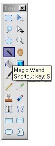
Step Two: Use the magic wand to grab all the visible elements
The handy dandy little magic wand is a useful tool to grab chunks of your image to work with separate from the rest. It may take some time to get the hang of doing it but keep trying. NOTE: In order to grab multiple areas, hold the CTRL key down as you click on areas to grab. Once you have all the areas chosen you can release the CTRL key. NOTE: If you have a lot of small areas to grab and are not sure if you got everything you can use CTRL-X to cut the selected areas. If you grabbed everything you wanted, everything should disappear. Don’t worry. Simply use CTRL-Z to make it all come back to the step you took before cutting.
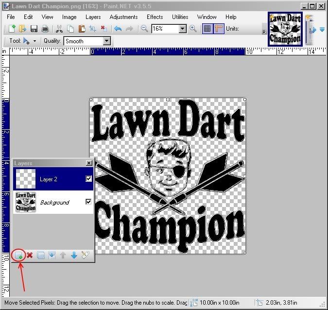
Step Three: Add a layer
Step Three: Add a layer
Now that we have all the visible elements lassoed, as it were, we need to work in a different level (in case we screw up.) So Add a level by clicking on the button at the “Add a New Layer” button on the bottom left of the Layers window.
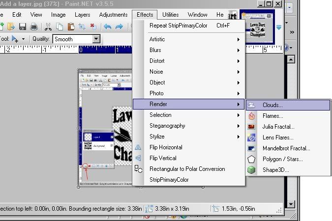
Step Four: Render Clouds
Step Four: Render Clouds
Once we are in the new layer, which should be blank, we need to render clouds by choosing Effects>Render>Clouds.
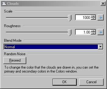
Step Five: Move Sliders all the way to right side
Step Five: Move Sliders all the way to right side
While the image will appear to have rendered clouds, you can adjust how they look by moving the sliders. For this particular tutorial make sure both sliders are all the way to right side. This will make the clouds a little more focused and not smoky.

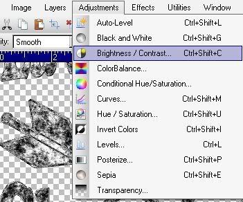
Now that we have our clouds rendered, choose Adjustments>Brightness / Contrast to open the Brightness and Contrast window.
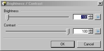
Step Seven: Move Sliders in opposite Directions
Step Seven: Move Sliders in opposite Directions
Moving these sliders will adjust how dark or light the blacks and whites are in your image as well as the contrast. For this tutorial move slider for brightness all the way to the left and the contrast slider all the way to the right. You should notice that the lighter areas of your clouds are now darkened leaving a jagged and pixelated appearance.

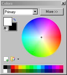
Step Eight: Make White Primary Color Choice
If you haven’t done so, already, you are going to want to make white your primary color in order to remove it in the next step.
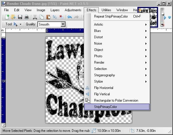
Step Nine: Strip Primary Color
Step Nine: Strip Primary Color
Choose Effects>Strip Primary Color to remove all the white in your image. If you do not have the plugin installed. You can get it here. This will leave only the black coloring on your graphic. Now you might ask, “Why even have white involved when rendering clouds?” To that I say, sometimes the clouds render in a less than favorable way leaving important elements of your design removed all together. By having black and white chosen as your cloud colors you can then invert the image to see if the colors show up better. I guess it could be six of one and a half dozen of the other in terms of steps but I like having options. That’s why I chose to do it that way. To each his own.
Step Ten: Release Magic Wand
Step Ten: Release Magic Wand
Once you have finished your removal of the primary color you can release your image from being lassoed. Easiest way is to choose another selection tool like rectangle or circle and then just click somewhere on the image. How does it look? Remember, you can always use CTRL-Z to undo steps or if you are really savvy go back steps by clicking on the one you want in your history window.

Extra Step: Change the color of your image
As I said in the beginning, I would rather make all my color decisions once I am done with the image. This way I can manipulate the overall color instead of having to paint individual areas.
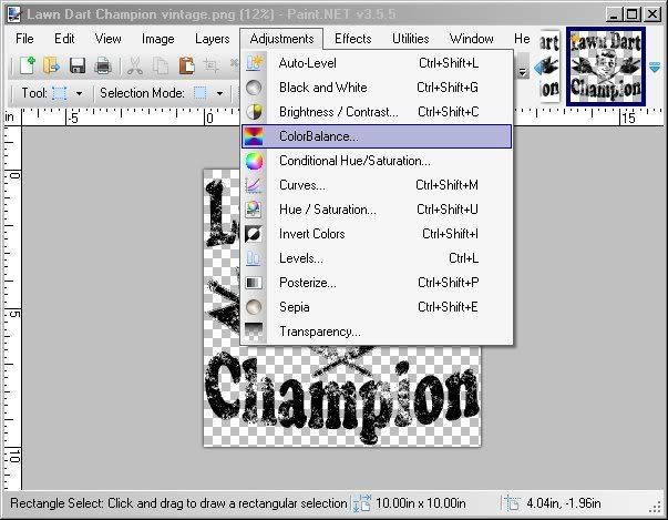 Choose Adjustments>Color Balance to open the Slider Window.
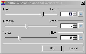
Move the Sliders to adjust the color how you see fit.
Find your desired color and click OK.

Have fun and Fade On designers.

Post a Comment