Showing posts with label HBO. Show all posts

The Westeros League: Riverrun Tullys

Posted by Mongo

Chugging right along in the Westeros League designs.  Next up... The Tullys of Riverrun.

Watch my Design It Video for
The Riverrun Tullys

For this one, I also wanted to stay away from well known professional teams.  The easy way out would be to look at the old Miami Marlins logo from when they were still called The Florida Marlins.  I did look to them for inspiration but didn’t feel like it would work as a design style.  I wanted to go more minor league with this idea.  So… I started doing searches on minor league logos with fish or nautical mascots when I came across the Columbus Catfish.


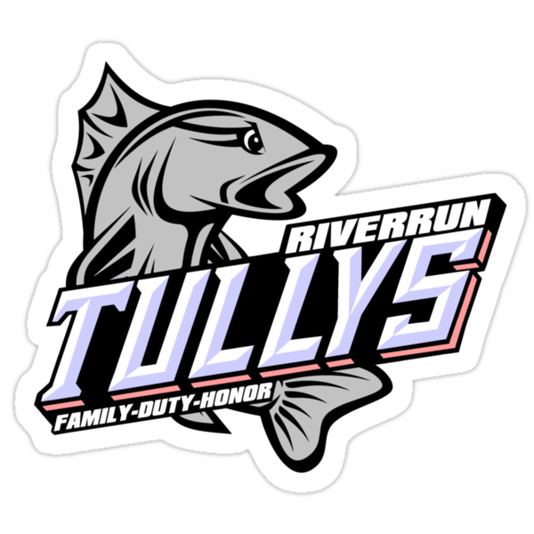
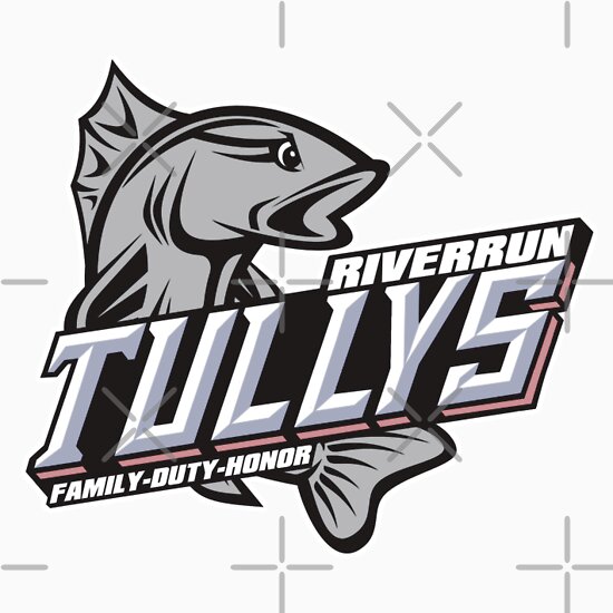
I liked how the fish called curled around the name.  I also liked how the team name was shaded and at an angle.   I found a fish picture and then redrew it facing the opposite direction, adding an angry eye to it.  Eyes are hard to do.  I’ve had a few designs that were crippled by the idea of having angry eyes attached to them.  Case in point, the Iron Island GreyJoys.  That Kraken was Cray with those eyes in the early stages.

After I finished up playing with the fish, I got started on the name.   That became another nightmare.  Here’s a little tip for you folks looking to do pop culture sport logos.  More often than not, the font style for a team name is custom.  Someone might come along and develop a font based on it, but for the most part, the customization is meant to encompass only the characters in the logo.  The rest of the alphabet isn’t usually a consideration.  So, when I looked at how the 3D visualization of the word “Catfish” had all solid bottom lettering, with very few gaps, I didn’t take into account that I had a “Y” in Tullys to deal with from a spatial perspective.  As it is, the fin of the catfish covers the bottoms of the “F” and “I” reconcile this problem.  I didn’t want to cover the “LY” in Tully because it’s not like we are familiar with a Tully like we are a catfish.  You can lose whole letters in catfish and know what the word is supposed to be just by association.  Also, the side of the S was hard because there is a break between the top half and the bottom.  I made several attempts at either splitting them or combining them.  That’s another thing I find hard.  It takes a real good eye to make three dimensional designs on a two dimensional plane.   I’m just getting the hang of it and still find it extremely difficult.

Now there are fonts like Chisel, Stowe Open Face , or Wednesday Matinee Shadow that sort of give you the triangular shaped letters with shading on one side, but again, the letters in these types of designs are usually customized for just those letters.  Catfish only shares two letters with Tullys, leaving me to figure out how to do a “Y“.  For the colors, I kept the silver color for the trout and let the red and blue play out in the lettering.  The blue was an easy match for the shadow of the lettering while the red became the sides of the letters which sort of matches the inspiring design of the Columbus Catfish.  I didn’t bother with the points at the middles of the letters because of the “L” and “Y” in Tullys making it more like a hybrid of the Spartan and Wednesday Matinee Shadow font types.  Probably the easiest part was the city and motto.  

In all, I think it’s one of my better looking designs.  I think it stands out as one of the best of all 14.    

You can check out my stores to see the Riverrun Tullys gear:
The Riverrun Tullys
Available from Skreened and Redbubble


Unisex Baseball Shirt from Skreened: $30.99
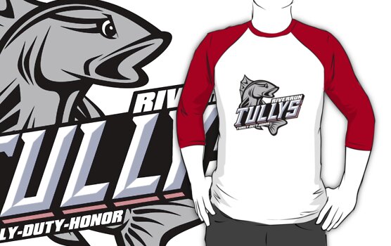

Baseball Style 3/4 Sleeve Shirt from Redbubble: $27.54


Dark Blue Hoodie from Redbubble: $47.40

Sticker from Redbubble: $2.40


iPhone 4S/4 Deflector Case
from
Redbubble: $37.20


See all of the Westeros League designs at Skreened and Redbubble.


The Westeros League: The Eyrie Arryns

Posted by Mongo

Next up for the Westeros League is The Eyrie Arryns


Watch my Design It Video for
The Eyrie Arryns


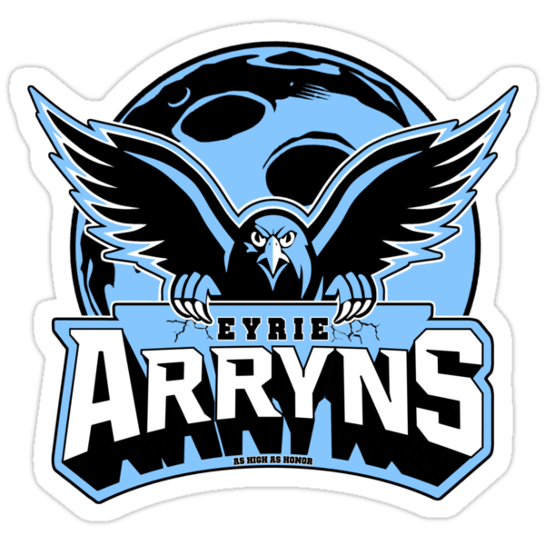
The obvious comparison to a major league American team would be either The Philadelphia Eagles or the Atlanta Falcons.  I did work off of a mix of the Eagles curvature with the MSU Spartans style of lettering.  I redrew a falcon pic, I had found, which was rather small in comparison. Now, I know what you're thinking.  "He done screwed up with this one. It's a blue falcon on a white moon"  And... you could be right.  However, I tried very hard to stick to the original colors from the House Arryn page on the Wiki of Ice and Fire.  The white moon was just not working with the overall design. 
Compare the test on the left and the finished on the right.
 
I needed the blue outline around the falcon and the signage didn't work with it intersecting, overwriting, etc.  So, I opted to go back to the blue moon and deal with it.  It was a late night and I was just too tired to go back and redo it.
Now, what do about the wording?  Where does it go?   I need to fit a moon and the falcon on the design as well as the name.  I tried putting the "Arryns" above the falcon, but that didn't leave a lot of visible background for the full moon.  So, I opted to place it below and have the falcon claw into the sign.  Even with the blue moon, I'm still a little bit perturbed with the way the outline around the wings falls behind the sign while the talons fall in front of it.  I had to duplicate the layer with the bird above and below the one with the sign so I could erase out the rest of the falcon that would be sitting behind the sign.
Overall, I'm about 75% happy with the finished product.
Check out my stores to see the Eyrie Arryns gear:


The Eyrie Arryns
Available from Skreened and Redbubble
Heather Grey T-Shirt from Skreened: $24.99
Heather GreyT-Shirt from Redbubble: $24.54

Grey Hoodie from Redbubble: $47.40
Sticker from Redbubble: $2.40
iPhone 4S/4 Deflector Case from Redbubble: $37.20

See all of the Westeros League designs at Skreened and Redbubble.

The Westeros League: The Bear Island Mormonts

Posted by Mongo

OK… new format.   Let’s roll.

Having only experienced the saga from the perspective of watching the show, I know there is a lot I’ve missed.  I also know there is a lot that is different. Season Three will probably jump the rails considerably.  However, I have tried to stay faithful to the books in terms of the designs of the various houses. Leaning heavily on A Wiki of Ice and Fire, I did some research to see how I could pull off the various themes and sigils as a sports themed logo. 


Watch my Design It Video for
The Bear Island Mormonts

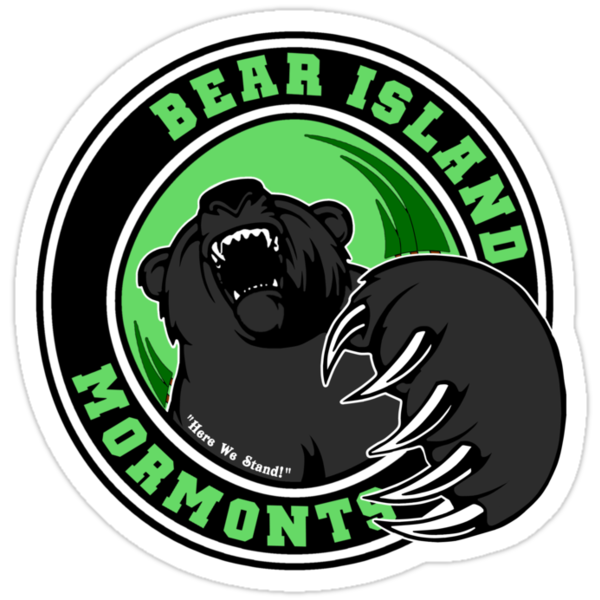
The Bear Island Mormonts was the first unfamiliar territory I broached.  Those of us “book” virgins have only been exposed to two Mormont characters.  Jorah, who is in service to Daenerys Targaryen and Jeor, his father, who serves as the Lord Commander of the Night’s Watch at the Wall.  That didn’t give me much to go on, so to  the wiki I went.

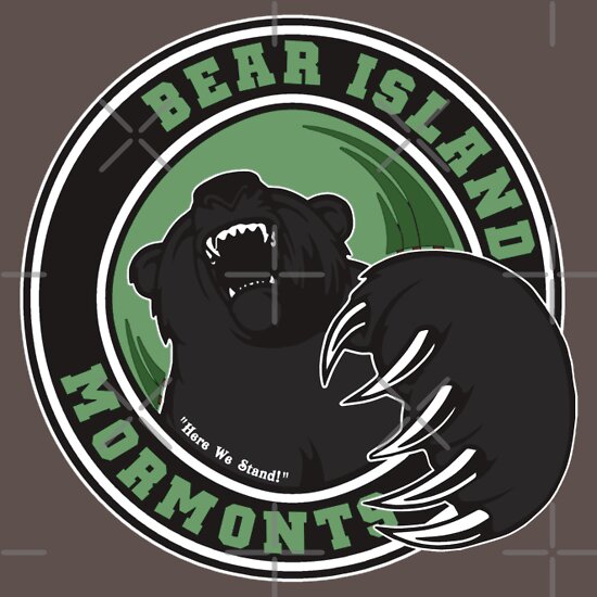
Once, I was a little more educated, I thought about how to bring the design forth.  It had to have a woodsy feel to it.  Now, there are plenty of Bears teams out there.  Of course, we all know The Chicago Bears but I didn’t see them as an influence.  There’s the Boston Bruins… but that doesn’t really have a bear in its logo.  So, I stayed away from mainstream sports.  I needed this design to be fierce… almost three dimensional.   I didn’t go really campy looking designs much yet.  Even the Greyjoys was played seriously as you can with a Kraken for a mascot.

I looked around at bear logos and bear drawings and redrew from a design I saw that really captured the feeling of being attacked.  I wanted a rounded logo but trees needed to be a part of it.   They were throwing off the lines being triangular, like pine trees are.  So, I sort of gave it a twisty look as if you are on the ground and the bear is on you.    I also included, as always, the motto, “Here We Stand”. 

From a logistical standpoint, it was better that I started out using the city name and the family name as the team instead of the animal.  Otherwise, the Bear Island Mormonts would have been the Bear Island Bears.  Yeah.. sometimes you have to plan ahead in these things or you will end up having to restart, jump the shark and change gears, or just continue going with what could end up as a bad design.  Of course I ended up having to jump the shark a bit later on with my last two designs.    I wanted to include them but thought it was going to be hard to justify the city/house name rule.  But… I think it worked out fine.  

Check out my stores to see the Bear Island Mormonts gear:


The Bear Island Mormonts
Available from Skreened and Redbubble


Heather Grey T-Shirt from Skreened: $24.99


Asphalt T-Shirt from Redbubble: $24.54


Grey Hoodie from Redbubble: $47.40

Sticker from Redbubble: $2.40


iPhone 4S/4 Deflector Case
from
Redbubble: $37.20


See all of the Westeros League designs at Skreened and Redbubble.

I Love Viking Vampires Shirt

Posted by Mongo

Screw Twilight.  Give me Sookie, Eric, Bill, Alcide and the others on True Blood!  Here's a tribute to Viking Vampires from Zazzle.

"Viking Vampires" by TrueBlood_Net
Many tshirt designs available at zazzle