Continuing the Westeros League design posts with the Night's Watch Rangers.
They are the last defense against the monsters beyond the Wall. Up at the end of the world, they are the sword in the darkness. Over two seasons they've trained and froze and waited for the chance to keep the things that go bump in the night away from the lands to the South. In season 2, we saw exactly what they are going to be up against as a horde of White Walkers came marching towards the gate.
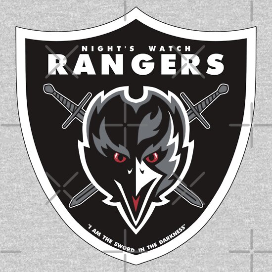
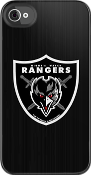
OK, the Night's Watch had to be included. But deciding how to figure this one out took some time and head scratching. There isn't really a city associated with those at the Wall. I couldn't decide what to even call the team. Do I call them the Crows, because there isn't a family name associated. Eventually, I settled on Night's Watch Rangers but still didn't have a masoct, so I went with the crows as they are sometimes called.
The immediate inspiration was The Oakland Raiders due to the difference of only two letters. I based the overall design on the logo of the Raiders but substituted a bird for a Raider and used the Bastard Swords instead of the Cutlass. Since there is no real house for the Wall, I went with the Raiders colors, using a small amount of red for the eyes and tongue of the crow. The last addition was putting in the motto of "I am the sword in the darkness."
You can find the Night's Watch Rangers in my stores:
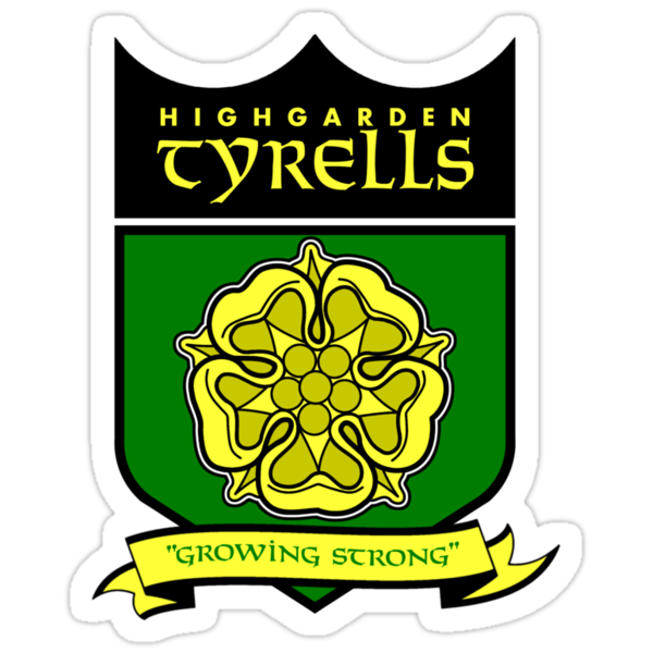
Kicking off the second half of the Westeros League, I went with the Tyrells of Highgarden.
I wasn’t going to include them, but sort of had to.After all, Margaery plays a big role in season 2 of the show, as does her brother Loras.The Tyrells are feisty, yet regal.So, in that aspect, I guess they should be included in the league of designs.
Watch my Design It Video for The Highgarden Tyrells
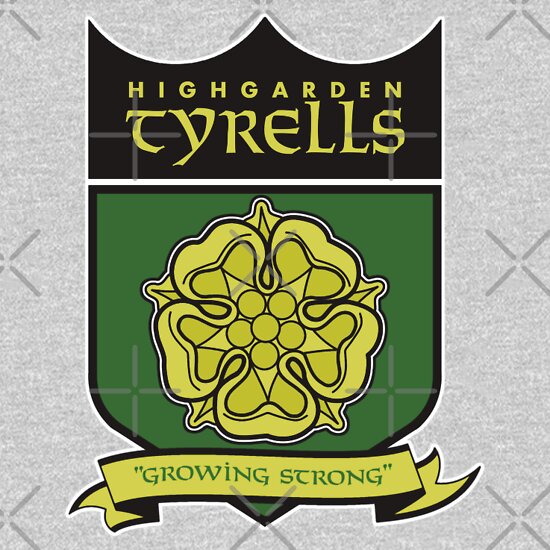
My biggest problem with bringing the Tyrells to life was how to adapt a rose sigil into a more anthropomorphic setting of mascots and logos.There are not a lot of flowers that function as a logo or label for sports teams.That led me to the only team that I could find that was based off of a flower, The New Orlean Saints.
The Fleur de Lis design on the Saints logo only served as inspiration from the standpoint of placement of a Golden Rose.The shield became more central to the logo.The lettering, I thought needed to be somewhat regal and ancient.I leaned towards Celtic or Scottish lettering styles for both the team name and motto. The colors followed the described ones from the wiki page I looked at.
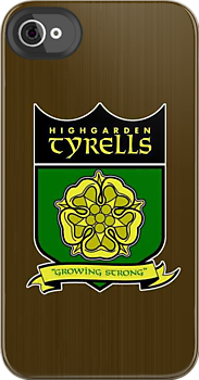
You can check out my stores to see the Highgarden Tyrells gear:
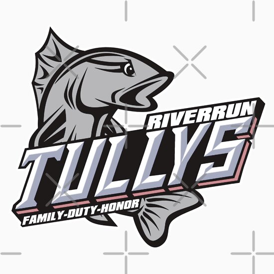
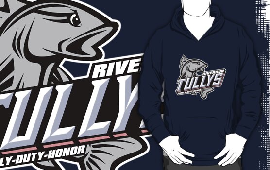
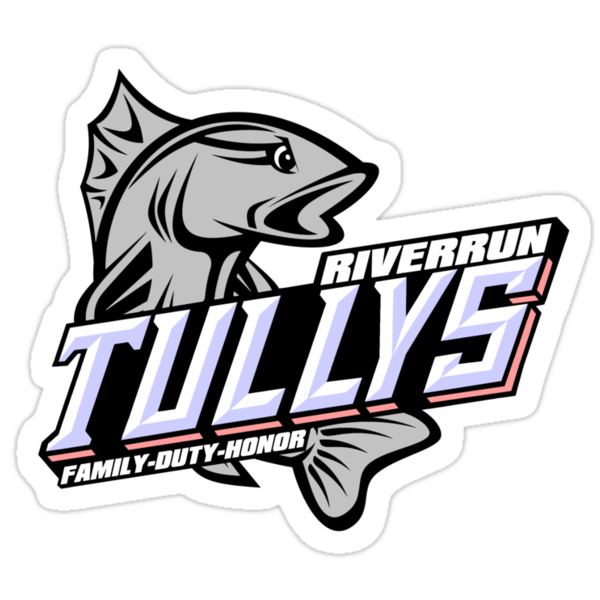
Chugging right along in the Westeros League designs. Next up... The Tullys of Riverrun.
Watch my Design It Video for
The Riverrun Tullys
For this one, I also wanted to stay away from well known professional teams.The easy way out would be to look at the old Miami Marlins logo from when they were still called The Florida Marlins.I did look to them for inspiration but didn’t feel like it would work as a design style.I wanted to go more minor league with this idea.So… I started doing searches on minor league logos with fish or nautical mascots when I came across the Columbus Catfish.
I liked how the fish called curled around the name.I also liked how the team name was shaded and at an angle.I found a fish picture and then redrew it facing the opposite direction, adding an angry eye to it.Eyes are hard to do.I’ve had a few designs that were crippled by the idea of having angry eyes attached to them.Case in point, the Iron Island GreyJoys.That Kraken was Cray with those eyes in the early stages.
After I finished up playing with the fish, I got started on the name.That became another nightmare.Here’s a little tip for you folks looking to do pop culture sport logos.More often than not, the font style for a team name is custom.Someone might come along and develop a font based on it, but for the most part, the customization is meant to encompass only the characters in the logo.The rest of the alphabet isn’t usually a consideration.So, when I looked at how the 3D visualization of the word “Catfish” had all solid bottom lettering, with very few gaps, I didn’t take into account that I had a “Y” in Tullys to deal with from a spatial perspective.As it is, the fin of the catfish covers the bottoms of the “F” and “I” reconcile this problem.I didn’t want to cover the “LY” in Tully because it’s not like we are familiar with a Tully like we are a catfish.You can lose whole letters in catfish and know what the word is supposed to be just by association.Also, the side of the S was hard because there is a break between the top half and the bottom.I made several attempts at either splitting them or combining them.That’s another thing I find hard.It takes a real good eye to make three dimensional designs on a two dimensional plane.I’m just getting the hang of it and still find it extremely difficult.
Now there are fonts like Chisel, Stowe Open Face , or Wednesday Matinee Shadow that sort of give you the triangular shaped letters with shading on one side, but again, the letters in these types of designs are usually customized for just those letters.Catfish only shares two letters with Tullys, leaving me to figure out how to do a “Y“.For the colors, I kept the silver color for the trout and let the red and blue play out in the lettering.The blue was an easy match for the shadow of the lettering while the red became the sides of the letters which sort of matches the inspiring design of the Columbus Catfish.I didn’t bother with the points at the middles of the letters because of the “L” and “Y” in Tullys making it more like a hybrid of the Spartan and Wednesday Matinee Shadow font types.Probably the easiest part was the city and motto.
In all, I think it’s one of my better looking designs.I think it stands out as one of the best of all 14.
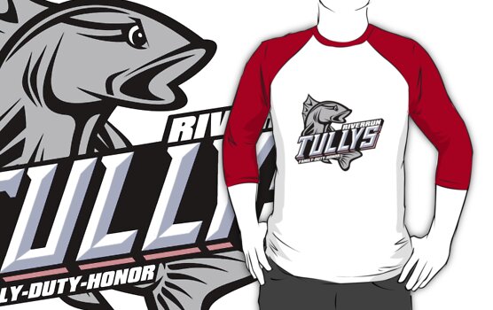
You can check out my stores to see the Riverrun Tullys gear: