
What kind of designer are you? Do you go with the original artistic approach where you simply design your own images and add them to shirts? Do you try and mimic or allude to pop culture themes from television and movies? (For example: The Overlook Hotel or Nakatomi Industries) Or do you try and be absurdist and catchy? Sometimes I try to be all three and find myself in a disorganized mess. Truthfully, I should have reorganized my stores to offer one category of designs and opened additional ones for different styles. In other words, one store dedicated to movie parodies or nods, one for geek wear, and so forth. In terms of stores, Zazzle and Skreened allow you to have multiple shops on one account at no extra charge. CafePress does too if you are using a basic service. If you are paying for a premium shop then you are limited to 500 sections per shop and must pay for another premium store. We’re getting off topic.
So, in one of my imagined niche stores I might want to feature funny or absurd designs based around a single style. That style is rapidly becoming a staple of the “funny t-shirts” market. It’s usage of what could be considered “retro clipart.” You know those Americana type images from the 40s and 50s of the guy holding a cup of coffee or woman wearing the apron. The simplicity of these images are usually coupled with absurd phrasings. The kind of thing that makes no sense when you imagine the visage of something like a 50s Leave It To Beaver Father saying he’s “pretty gangsta.” Somebody thought it would be funny to pair up these contrasting styles and managed to come up with something that was funny at first but then became easily imitated and often duplicated on a variety of topics. Hey, I’ve done it. But I try to be a little bit more absurd or clever. Sometimes I come up with the funny. Sometimes I don’t. But I became obsessed with jumping on the sell out bandwagon.
I knew it was pretty bad when I just started looking at all the clip art I had and tried to make up something funny to go with any picture. But, the more I tried to be creative and original in my designs, the more I found myself copying others or at least approaching their idea from a completely different angle. I even started looking for fonts that were comprised of retro looking clip art from the 50s. Remember, folks, dingbats are not a toy. I was becoming a cliché. Then a stroke of brilliance came over me. Why not parody the cliché?
This shirt is more for designers and shopkeepers who get the joke. You have to be familiar with the shirt market to know what I mean or at least have a sense of humor that loves a good parody. With that I give you…
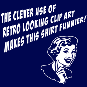
To get a sense of where I’ve been overdoing it. Here’s a few of my clichéd ideas over the past few months. I didn’t realize how bad I’d become until I started looking through my portfolio. And yes, I just realized how pretentious that made me sound. Sorry, my folders.
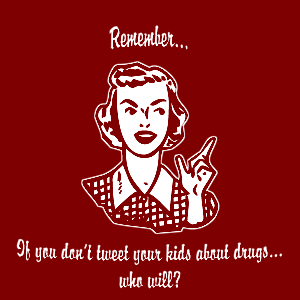
This was one of the first clip art inspired designs I did. I looked at it as a melding of Web 2.0 and the PSA style of talking to your kids about drugs with retro pop art. Unfortunately, the original design for the dark shirts were simply a negative image because I hadn’t discovered the easy way of removing the primary color from images that I spoke of in a previous post.
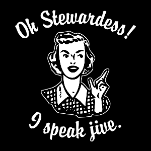
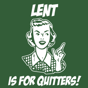
Ahem… See, I told you I was getting desperate. Here we have the same frickin’ image of that 50s housewife. I did this for Easter as a riff on the “Rehab is for quitters” motif.
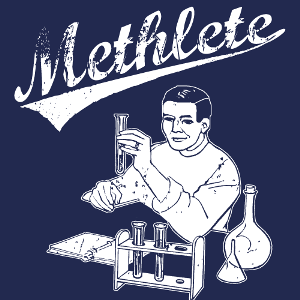
I saw a shirt from another site that sported, what looked to be, a 1950s era white picket fence house with a 1950s type guy making the comment “Ask me about my meth lab!” I thought it was somewhat funny and decided to parody that idea with the Mathlete idea. So, I coupled a retro styled chemistry set and scientist with the Athletic team style of font.
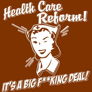
This one was typical but a short lived story about VP Joe Biden dropping the F Bomb into Obama’s open mic after the Health Care Bill Passed. I thought if you are going to go opposite ends of the spectrum, why not have a wholesome looking 50s style nurse say Health Care is a big f**king deal?” This one actually sold a few before the story died down. And I at least offered it in the NSFW version as well as the censored version just in case you didn’t want to offend people.
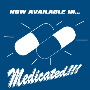
I'd seen a few clip art style shirts with the cocktail glass guy saying, "Also Available In Sober!" That's pretty funny but let's take it one step further and say that you are now taking medication that allows you to be socially interactive without the general public afraid to be around you and sharp objects. Hence the 1950s style of advertisement touting that you are now available in medicated form.
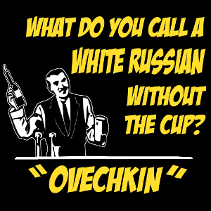
After the Washington Capitals’ disappointing loss to Montreal in the playoffs, Pittsburghers simultaneously breathed a sigh of relief and started joking about Ovie’s inability to get a Stanley Cup. This joke got passed around in the process, “Guy walks into a bar and asks the bartender for an Ovechkin. The bartender says, ‘What’s an Ovechkin?’ The guy says, ‘It’s a White Russian without a cup.’” So, I took the joke and reworked it with an image of a retro looking bartender and the punch line. Sold three right off the bat.
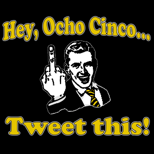
This was in response to Chad Johnson saying he was going to put up twitter posts while on the field. This guy continues to be a show off yet rarely scores a touchdown when playing Pittsburgh. I refuse to call him Ochocinco because not only is it a pretentious douche nozzle type move, the idiot didn’t even use the correct translation for his jersey number, 85. Ochocinco is 8 5. The correct translation… according to Babel Fish is ochenta y cinco. Congratulations, you’re stupid in two languages.
Since I’m a diehard Steelers fan anyway, I figured why not combine my thoughts with some retro looking bird flipping.
So, there you have a long winded post about the wonders of clip art cliché shirts.

I love drop caps! Here's an oldie but a goodie in the public domain, of course.
residential fence installation
Posted on January 27, 2018 at 6:34 AM
Post a Comment