Simple and Funny Halloween Costumes

Posted by Mongo

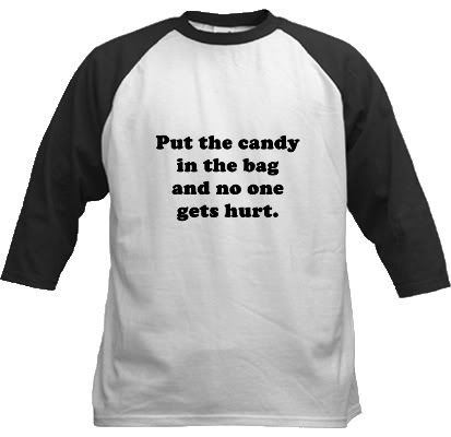
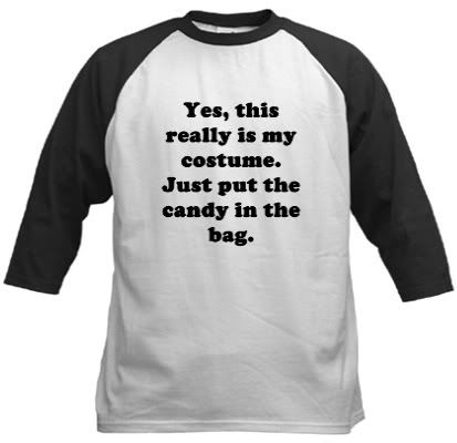
People who celebrate Halloween sometimes go all out with the decorations or costumes. A lot of time and money can be spent perfecting that impersonation or abstract thought in the form of a Halloween Costume. For those of you who go out trick or treating you might find that it’s a daunting task to come up with something original or cool in order to impress the home owner holding the candy bowl. However, you could be completely jaded or fed up with continually coming up with a good costume only to have countless conversations involving you explaining exactly what you are. Let’s face it, if you have to explain it, you lose the element of originality and coolness. So, this year, let everyone know that you are in fact wearing a costume and you are just here to get the candy with a couple of different designs which are basically just plain text. Simple and to the point. Both designs are available in multiple styles and sizes of shirts as well as buttons.


Rectangle to Polar Conversion in Paint.Net

Posted by Mongo

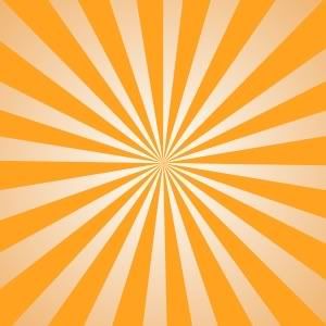
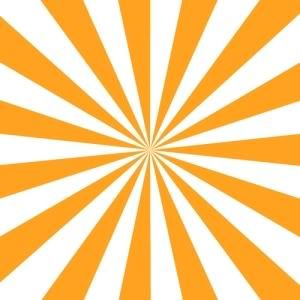
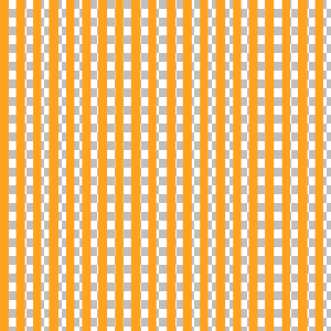
Here’s a neat little tip for you designers out there who don’t have Photoshop. Have you ever wanted to make one of those images with a bunch of different colored stripes emanating from a center point? It’s kind of like something in the realm of perspective. As the lines move from the center they grow in size. Here’s an example of what I mean.


Well, I used to be able to do this years ago in Photoshop, but since I primarily use Paint.net…..which I should note, I just got a copy of PhotoShop CS4 Elements but haven’t installed it yet…I’ve been trying to tackle it there. Sometimes, though, even the craftiest of designers need a little help once in a while in the form of plugins. Developers out there, who work with Paint.net create these plugins to do things that the normal version of Paint.net can’t do. One of them is a rectangular to polar conversion. You can read more about it and even download the plugin here.

Simply follow the instructions on how to install it and you are on your way. Now, let’s recreate that image above. You can choose any combination of colors you want.

First off, create a new image. I would keep it as square as possible for starters. I’ll use my normal 2000 x 2000 pixels with 200 ppi resolution. Of course, I’ll shrink it for display, here.

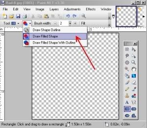
Now, looking at your blank screen, grab one color and switch to your Rectangle tool. Make sure you change the setting to Draw Filled Shape. This will create solid boxes instead of outlines.


Start making stripes running from top to bottom. The more stripes you add the more you’ll get in the end. If you want to cheat a little bit make about five stripes. Then use the rectangle select to draw a box around those stripes. Copy the selection and then paste it back into the image. Drag it to the end of the last stripe and instead of creating one stripe at a time, you now have five. This will make filling up the canvas easier and with less chances of screwing up the widths. It helps if you space them apart, equally. As you get better you can play with spacing to create different effects. For now, make them all the same distance from each other. Like so.


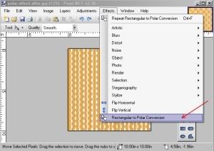
Now, you can do this next step now, or later depending on your own preference. I choose to do it now because….this is my tutorial. Anyway, if you have loaded the plugin, you should be able to find it under Effects>Rectangle to Polar Conversion.


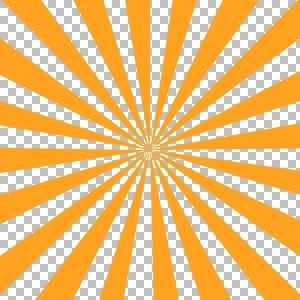
The effect automatically converts the top of the image into a single fixed point in the center of the image. If done correctly you should now see the image below. If you don’t, hit Ctrl-Z and see what happened. You might not have extended the stripes to the end of the canvas. Here's what it should look like.


That’s all there is to it. Go and play around with it and see how you can create effects that you can use in other images.


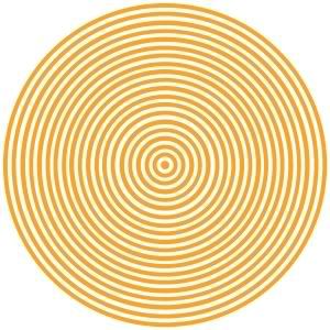
Q: What happens if I create horizontal stripes?A: Since the effect essentially takes the top of the canvas and bends it into a circle, if you used horizontal stripes you would get circles. A nice effect if you want to do bull’s-eyes or other weird things.


Q: Why do you like layers?
A: Working in layers allows me to create other effects or make changes without having to do a lot of backtracking. For instance, say you don’t like your color choices. If you did everything on one layer, you have to either undo or hope that you can work on top of what you’ve already done. With layers you can change one color or both without affecting the other. Here’s another cool effect if you use layers. Go to your lower layer and choose the gradient tool. Click and drag the mouse from the center to create a gradient. Pretty slick, huh?


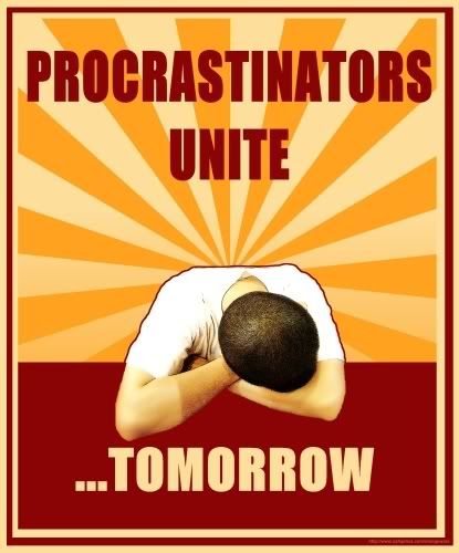
Here is an example of how I used all these steps in a design.


Each one of these elements, the sleeper, the text, the burgundy bar at the bottom, the boxes around the outside, and the stripes were all created on separate levels. That gave me the ability to mix and match, tweak and change a lot of stuff on the fly to get more flow from the design. I used the polar effect and gradient tool to create the stripes, just like I showed you. Go! Create! Have a good weekend!

Procrastinators Unite Tomorrow
Procrastinators Unite...Tomorrow.Available at Mongo Angry! Mongo Smash!

polar effect gradient

polar effect horizontal
You are getting very sleepy...

polar effect after
Finished two color image

polar effect after
Finished Rectangle to Polar Conversion
Now, let’s tackle the secondary color. For the example, I'll use white. You can do this in two ways. The first is to choose the paint can and just fill in the gaps between stripes with your second color. The second method, which I like better is to create a new layer below this one and just fill in the entire image with the paint can. Since the layer on top has the stripes it will cover the areas on the layer beneath. Personally, I like the second method because it leaves no chance for bleeding into the other color and depending on the difference in colors it may bleed more leaving you with uneven or jagged edges. It also allows you to do other effects.
Polar Effect Tool
Rectangle to Polar Conversion Effect in Menu

polar effect before
Stripey


Draw Filled Shapes
Draw Filled Shape Rectangle

polar effect after
Neverending perspective effect

Free Shipping Through October 23

Posted by Mongo


FREE SHIPPING ON $40 AND UP THROUGH OCTOBER 23!

Coupon code: SHIP4FREE

Disclaimer


Pop Culture University

Posted by Mongo

I have devoted a sub section of the store to a collection of designs based on or inspired by fictional schools in pop culture. What started out as just a couple of 80s films has grown into ten different schools, so far. They range from high school to college and universities. In most cases, I have tried to recreate the original logos and mascot designs from the original films, while a couple were nods to what was almost impossible to figure out from countless repeated viewings of specific scenes, trying to study the actual logos which were obscured, hidden, or too small to see. What I found after viewing many films was the lack of attention to detail that came from costumes and props being consistent throughout the movie. A lot of the fonts used for school names change from prop to prop. Films are funny that way. Most people don’t notice it because of the angle of placement or amount of screen time.

Almost all of the designs are on the front with a few exceptions of being printed on just the back. In some cases, I have opted to offer front and back side printing for specific characters from a film. One is for the West Canaan Coyotes from the film Varsity Blues and the other is for Shermer High School from The Breakfast Club. This is something I also offered for the Hamilton Mustangs design from Youngblood once I got the hang of it. Here’s what the section has to offer, as of now.

Ridgemont High Wolves
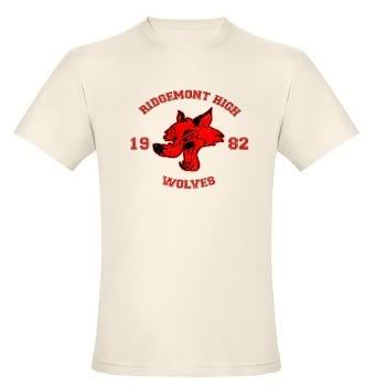
From Fast Times at Ridgemont High

I took some liberties with the mascot design as I didn’t have a good reference point until after I got the opportunity to re-watch the film. Then again, I was hung up on the pool scene… I am also thinking about recreating the Captain Hook Fish and Chips if I can get a good look at the box Brad Hamilton was loading before he goes to IBM in his pirate outfit.


William McKinley High School Glee Club
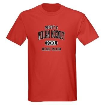
From Glee

I will say I am a huge fan of the show and wanted to get in front of the pop culture bus instead of being underneath it. It’s already picking up some momentum and I actually like the black text on red shirt design best. This one of the many existing Property of… shirts in the store.


West Canaan Coyotes
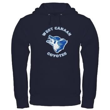
From Varsity Blues

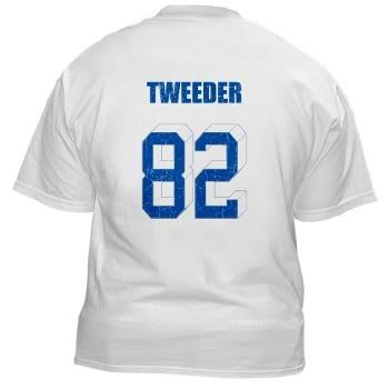
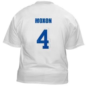
I admit when you compare the film to say Friday Night Lights it’s not really a fair assessment of quality, but it terms of MTV generation popularity, there is a huge demographic of people more interested in VB than FNL. It was actually the suggestion of a friend of mine to include this design as well as offer the back side printing of the name and number of certain players. It kind of sucks that it costs an additional three dollars to include the back side printing so I offered the same products with only the front side design and then created three sub sections for the following.

Lance Harbor
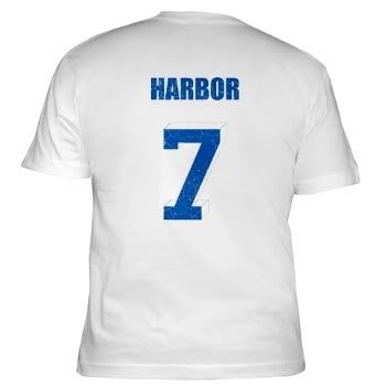

Billy Bob
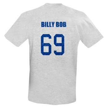

Charlie Tweeder

Jonathan Moxon


Thompson High Warriors
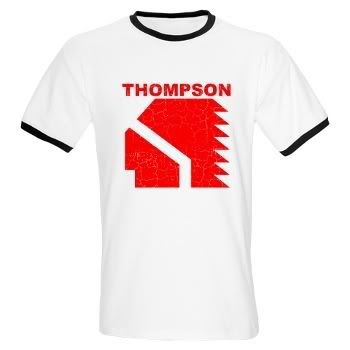
From Vision Quest

Once again, a good friend suggested this idea because of a cult status among his friends. This one comes in a few colors for the designs to take advantage of the two red shirt colors.


Central High School Wildcats
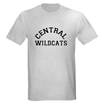
From Wildcats

Football…Football…before they taught a white man to jump or robbed the money train, Wesley Snipes and Woody Harrelson played high school football together on screen in Wildcats, despite being 24 and 25, respectively, when it was filmed. Maybe they got held back a lot. I searched and searched for an image of the mascot that I could incorporate and finally just decided to go with the logo on their jerseys.


Santa Carla High School
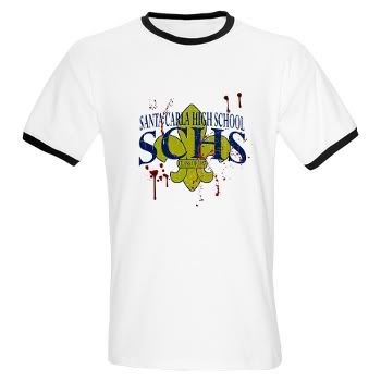
From The Lost Boys

While there is no real mention of any of the characters going to high school in the film, I wanted to portray the age of the characters in reference to actually attending a high school. In this case, the high school is partially based off a real school called Santa Clara High School in Freemont California. The additional traces of blood on the shirt are a nod to the wearer being a snack for all the damned vampires that live in the area.


Wolverines
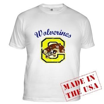
From Red Dawn

If you were to simply look at this shirt you probably wouldn’t get the reference. I like being a little obscure. There are a lot of shirts out there with the graffiti logo from Red Dawn which is highly recognizable but this is about school designs. Since Calumet, Colorado is where the Wolverines are from, I went with a design inspired by the Wolverine logo on the characters’ jackets and the one on the scoreboard at the field. These were all pulled from watching clips of the opening attacks.

Westerburg High School
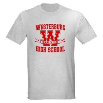
From Heathers

This one is perhaps not so obscure. Anyone who knows the movie knows the name of Westerburg High School. Anyone who REALLY knows the movie knows it was named for Paul Westerberg of The Replacements. Finding a mascot was hard so I pulled the inspiration from the cheerleaders design in the pep rally scene.

Faber College
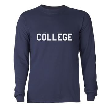
From Animal House

Ok, every shopkeeper on every site from CafePress to Zazzle to Spreadshirt has probably thought about or actually created a mock up of the famous COLLEGE shirt that John Belushi wears in the film. So, why not? Sell out? Yeah. I’ll admit it.


Grand Lakes University
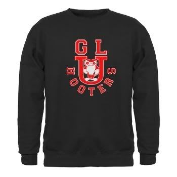
From Back to School

I was surprised that no one else has thought of doing this design. There are some for Thornton Mellon School of Business but none for Grand Lakes University Hooters. This was another hard one to work up with little reference. The cover of the DVD has Rodney Dangerfield wearing a sweater but it’s really hard to see the owl. There is also a scene where a few binders or stationary material show the owl in the book store but still it was really tough to get a clear screen capture of the logo, so I did a lot of guesswork and extrapolating from what I could find.

Adams College
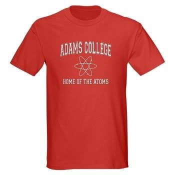
From Revenge of the Nerds

I wanted to stay away from Fraternity and Sorority lettering because everyone else had done it, so I went with the basic logo of an atom for the middle and added the tag line Home of the Atoms underneath.

Shermer High School
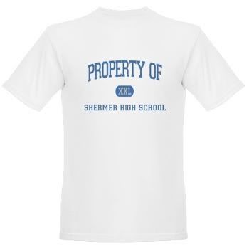
From The Breakfast Club

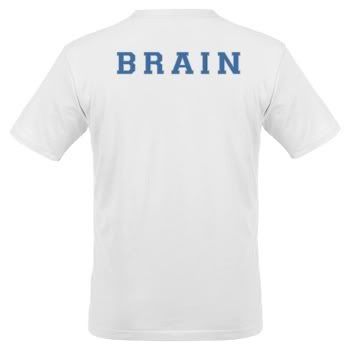
Here’s another multiple offering in the case of backside printing. I have a line of products with just the design on the front and then individual lines for the front side design and a backside text only image across the shoulders denoting each character’s “class” status being Brain, Athlete, Princess, Basket Case, or Criminal.

NASA Bombs the Moon

Posted by Mongo

NASA sent a rocket to the Moon. It wasn't in order to explore it like the Apollo Missions did. It was to crash into it...on purpose. In order to see if water was present in the hopes of someday colonizing the moon, they crashed a sensor laden rocket into a crater to test the plume. It was the equivalent of the Coyote falling off a huge cliff, ending in a small puff of dust at the bottom.

But exploding ACME products aside, we here at M.A.M.S. The Store, we look at this as an opportunity to explore how news influences the Internet social networking sites ability to keep up with the times and in turn influences us.

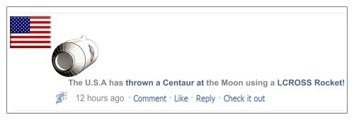
Here we have Facebook recording that The United States has SuperPoked the Moon.


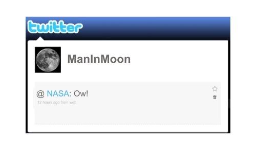
Of course, the Moon tweeted how it felt about such an act.

Finally, we made a shirt about NASA searching for water on the moon.


Isn't science and the Internet fun?

Zombie Ware

Posted by Mongo

The zombie genre of entertainment is a huge playing field full of games and other memorabilia. Because of this, I decided to dedicate an entire section of my shop just to zombies. Why? I love them because they provide a great commentary on society. Commercialism, Politics, War, etc. You can take any genre of fiction and plop in zombies and you have a sort of Greek chorus that symbolizes a message about the issue. I fear them because out of all the things that could happen in this world, whether it be nuclear war, economic meltdown, or any other host of threats, zombies are a substantial equalizer. If the possibility were there, they would be a huge threat. Not to mention the idea of your loved ones turning into a zombie and attacking you puts you in a huge pickle. I truly believe there could be a viral outbreak much like 28 Days Later, turning people into raging killers. However, I don’t believe that it will be like the Romero films with flesh eating reanimated corpses.

Currently, I have 12 designs, four of which all play off the same theme.

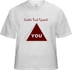
This is a parody of the nutritional Food Pyramid you see on places like MyPyramid.Gov. Instead of breaking down the different food groups by type, zombies will most likely just see YOU as the entire pyramid.

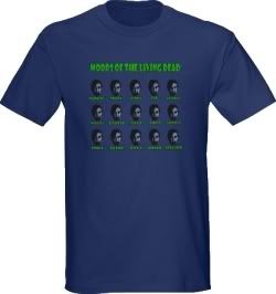
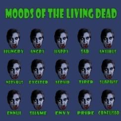
This is a parody of the “How are you feeling today” posters and such. Of course, in the case of zombies, they don’t exactly show a lot of emotion…so, well, you get the idea. If anything else, it was the perfect chance to use the word ennui in a design. I also did a similar one for Alien Moods.
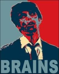
This one came about during the Presidential Race of 2008. I noticed a lot of people using, what is now called, the “Obamacized” or “Obamanized” image for just about everything. It’s the way of inking a picture with red, white (beige), and blue shades inspired by the Shepard Fairey print of Barack Obama Hope Poster. I thought I would jump on that bandwagon with a zombie design and took created my own image with the word BRAINS instead of HOPE. It’s sold as a poster last month.

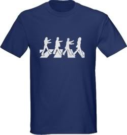
Parody of Abbey Road with three zombies lurching after the leader (John Lennon.) This was in the works from the beginning of Zombie Ware but took a while to perfect. Each limb that crossed over a vertical stripe didn’t look right as a silhouetted design. They all got lost in the background. I ultimately decided to make the vertical stripes white. Then, I had trouble figuring out the best way to do the inverted color for dark shirts. Unfortunately, I didn’t do this entirely in layers and ended up having to zoom into the image to etch the outline of each leg. I learned to do each element as a layer from then on, especially when silhouetting images.

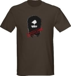
Please forgive the imagery and parody of religion depicted here. I was inspired by a line from Futurama where Professor Farnsworth cries “Sweet Zombie Jesus!” on occasion.

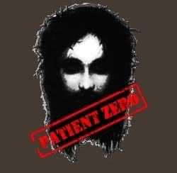
Christianity and Zombies go hand in hand. After all, if you take a look at Jesus Christ, he lived, was killed, and then rose from the dead. He is the original zombie, patient zero if you will. The trick of this design was depicting Jesus as a darkened figure while still maintaining the realistic look of him in most images. I simply took the brightness down to where it held the symbolic look of Jesus with a crown of thorns but gave it that darkened appearance that kind of lurked in the shadows. Then I stamped it with a stenciled font of the words Patient Zero.
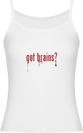
It’s simple. No frills. No need for explanation. It also doubles as an excuse for someone who appears to be stupid. The Content Usage Police actually pulled this one because they felt my design could be confused with the trademark for Neuromart. I just don’t see it. The design is not using the same font nor context in consideration for the study of neurology or actual brain related novelties. I’m talking about eating brains….or lacking them in the case of someone stupid. In any case, it’s back up and I’ve had no troubles with it.


Zombie Task Force
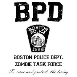
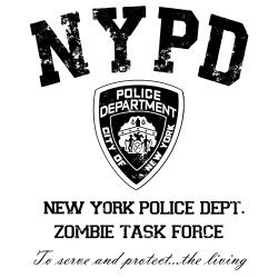
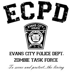
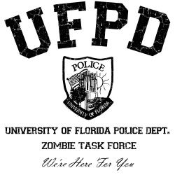
I recently did a post on the University of Florida’s website linking to an exercise for zombie attack preparedness. This was actually the fourth design in the series of Task Force ones starting with the Boston Police Department. This all stemmed from the Twitter feed earlier this year where an officer was reported being bitten by a suspect. A follower tweeted back, “If that was a zombie bite, would you tell us?” The response from the BPD was, “Yes, absolutely.” Thus cementing my theory that Boston is the place to live if you want to be made aware of a zombie outbreak before it’s too late. The Boston version has sold modestly over the last few months which spawned the NYPD version and, of course the Evans City version for all the fans of the original Night of the Living Dead followed by the UF one. I mimicked the style of various city Police Department shirts with mock ups of the badges or patches and the abbreviations in block lettering which is actually a college or university name style font and gave all the designs that aged look for effect.
This is a recreation of the WGON-TV logo for the television station seen in the beginning of the original Dawn of the Dead. Nothing out of the ordinary with the designs. I simply made a series of concentric circles on different layers. The top layer then served as the text which was rendered by using the magic wand/lasso and rectangle select tools to cut out everything that wasn’t a part of the text.
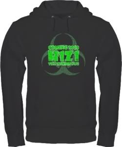
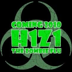
Playing on the Swine Flu outbr….do we call it a pandemic, yet? In any case the designation for Swine Flu being H1N1 gave rise to popular culture calling a viral zombie outbreak H1Z1 which led to the nickname Zombie Flu, which led to this design.

Like I said before, if there ever were to be an outbreak of zombisim or as the UF exercise called it , Zombie Behavior Spectrum Disorder, it would most likely be a virus. The original Night of the Living Dead never directly cites the reason but speculates that radiation from a space probe that exploded in Earth’s atmosphere caused the incident which is then transferred to others through infection or whenever someone dies and still retains enough brain to reanimate, as in the case of Barbara’s brother, Johnny. Max Brooks’ novels cite the outbreak as being caused by a virus called Solanum in which the dead do not rise from the grave, but people die from infection and reanimate.
Keep an eye out for more designs. With it being close to Halloween zombies are definitely on the brain....
bad joke.

University of Florida Police Department Zombie Task Force

Posted by Mongo

It’s been a good year for zombies. The opening of Zombieland in theaters is perfect timing for the genre. While you sit there with your popcorn, think about this, “What is your zombie plan?” Recently, the UF website listed, among other disaster preparedness exercises, a plan for the campus to handle a zombie attack. Unfortunately, as amusing as it was, the administration thought it a little silly and had it removed. Thanks to the power of the Internet, someone preserved a copy. Truthfully, this is a well thought out document. Hysterical, but well planned. I personally like the terminology of ZBSD (Zombie Behavior Spectrum Disorder) and the fact they have a Infected Co-worker Dispatch Form.

This all flows from the fact that earlier this year, zombies have been on the brain among civil services. Pun intended. First there was the geeks that hacked an Austin DOT digital road sign and changed the message to WARNING ZOMBIES AHEAD! Then there was the Boston Police Department’s Twitter Feed explaining their transparency when dealing with a potential outbreak. Would they let us know? Absolutely.

So, of course, I’m all over this like a reanimated corpse on gray matter. I give you a designs for the...


The design uses the abbreviation of UFPD for the department above a recreation of the badge for Campus Police. Underneath the badge are the words, "University of Florida Police Department Zombie Task Force." and the stylized phrase "We're Here For You." All the standard products are there including mugs, tote bags, magnets, hats, and various shirts for the whole family.

I fully expect to have this one pulled but wanted to get it out there while I tweak the design in case of Content Usage Police Force. I used my previous designs for the BPD, NYPD, and Evans City PD Zombie Task Forces as the template in creating this one.

Booby Traps for Breast Cancer Awareness Month

Posted by Mongo


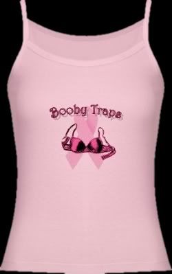
October is National Breast Cancer Awareness Month. While I tend to be a little silly and juvenile in my humor, I am doing it here for a good cause. That’s why I am donating all profits I receive from sales of any item with this design at CafePress or Zazzle to a Breast Cancer Awareness group called Stacking the Odds. I won’t try and butcher their mission by explaining what it is they do, let’s just say it involves competitions that stack Oreos for Breast Cancer Awareness and they have a sense of humor. It was founded by a friend of mine. Being directly affected by cancer in my own family, I am all for any kind of help towards finding a cure, regardless of the specific type.

Here’s how it works. CafePress gives shopkeepers sales reports that can be filtered in many ways, including by design. I will use them to determine the total amount that will be donated, separate from any other sales I get from other designs. With CP only giving shopkeepers 10% of all sales through the marketplace, I am hoping to drive a lot of traffic directly to the shop in order to increase the profit I can donate. I plan on adding a widget of some sort to track sales of the design, but I need to wrap my head around that and figure it out. Hopefully, soon.

The design comes on all the standard productcs including mugs, buttons, tees, etc. If there is something that you particularly want, get in touch with me and we'll talk.

Try to keep the snickering to a minimum. Oh, who am I kidding? Laugh at it, point, click and buy something, anything, to support National Breast Cancer Awareness Month this October. Actually, support it any month because the design isn’t going away after October and I will continue to donate all profit I earn from Marketplace or Shop sales to Stacking the Odds. Spread the word to any and all.

As always, thanks for your support.

And….


Boobies.


There I said it.