Showing posts with label logo. Show all posts

The Westeros League Designs

Posted by Mongo

Over the past couple of weeks, I've been putting together a post for each team design. The first four teams got a fictional report of how their seasons were going.  That become cumbersome and I scrapped it for a straight forward approach.  So, beyond the Baratheons, Greyjoys, Starks, and Lannisters, it's more about what inspired me, the approach, obstacles, and talking points.

Included in each post is a larger version of the design and links to the stores and different products they adorn.  For now, I only have them on Redbubble and Skreened.  At Skreened, they are available as t-shirts or hoodies.  Redbubble has a wider selection including shirts, hoodies, stickers, iPhone cases and soon to be iPad cases as well. 

The giveaway will be coming shortly as I continue to gather up all the prizes for it.   Stay tuned and enjoy.


The Westeros League: The Cape Wrath Seaworths

Posted by Mongo

We’ve finally reached the end of the league.  The last design is up and it’s one of my favorites just because of the hilarity of how it came up during the show.

Davos Seaworth has had a hard life.  He’s down a couple digits and was witness to the biggest “WTF” of the series so far, the vagina wraith.  Seriously, when I saw that I was like, “DAFUQ!?!?”

But Davos’ most hilarious tale was how he flies the flag of an onion on his ship.  That alone made his inclusion into the league a definite.  But… how do I bring an onion design to life in a league of animals, people, and flowers?

I tried to do this as a ship design, much like his sigil image from the Wiki of Ice and Fire entry.  
  
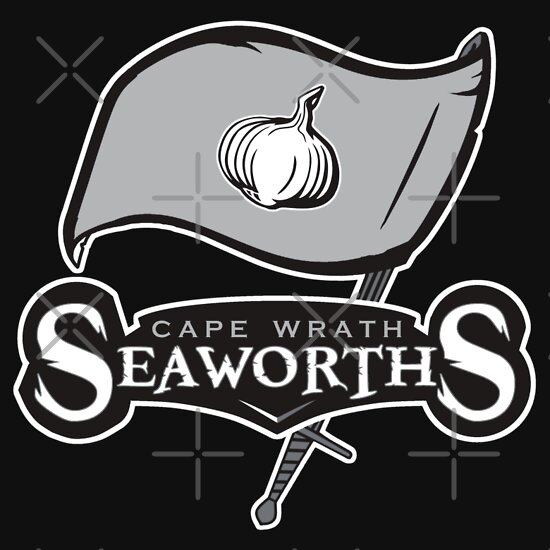
However, the design of the ship overshadowed the onion, dwarfing it.   Then, I went back and looked over the professional logos for some inspiration and it was obvious where I should go for the design,  The Tampa Bay Buccaneers. 

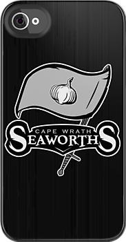
I took the Bucs design and used it as a guide.  I didn’t make it as tattered since the colors would blend and it be hard to see.  Instead of the cutlass holding up the flag, I went with a bastard sword, much like the Rangers’ design had.  For the text, I went with a less Tiki looking font and more of a pirate-y shredded one, maintaining a likeness to the Buccaneers’ logo.   As for the Skull and Cross Bones from Tampa Bay’s flag, I ditched the idea of including my own with an onion in the place of a football.  The onion here suffered the same fate as the original intention to use a ship for the design.  Instead, I left the onion front and center in the middle of the flag.  I did keep the black and grey coloring, even though I already had several ones using those colors.  

In the end, I was extremely happy with the overall design and it still makes me giggle every time I see it.  Then, I think, “vagina wraith” and I’m in a fetal position on the floor.

That concludes the designs in the Westeros League.  I hope you enjoyed these posts as much as I enjoyed creating the designs.  Stay tuned for a giveaway coming up in the near future.

The Cape Wrath Seaworth’s is available from my stores, now.

The Cape Wrath Seaworths
Available from Skreened and Redbubble


Smoke Anvil Unisex T-Shirt from Skreened: $26.99


Black T-Shirt from Redbubble: $24.54


Pullover Hoodie from Redbubble: $47.40


Sticker from Redbubble: $2.40


iPhone 4S/4 Deflector Case from Redbubble: $37.20


You can check out all of the Westeros League designs at Skreened and Redbubble.


The Westeros League: Clegane's Keep Mountain Hounds

Posted by Mongo

We only have two designs left to showcase and they were alternates.

I say alternate because they are sort of done with tongue in cheek.   Most people will not get them unless they are familiar with the source material of the books and shows.  In fact, the only reason I did one was because I had to do the other out of sheer joy of bringing an onion into the mix.

The first is a hybrid of sorts.   Sandor and Gregor, the Clegane brothers feature prominently in the series.  In fact, my first huge “WTF” moment, other than the incest, was Gregor decapitating his horse at the joust tourney.  It was brutal because of how long it took.  Now, as evil as a person he may be, I still hold a bit of a soft spot for Sandor, but he has his own demons as well.

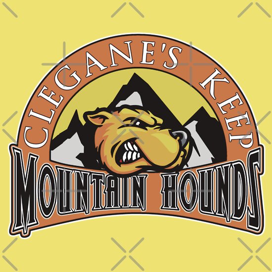
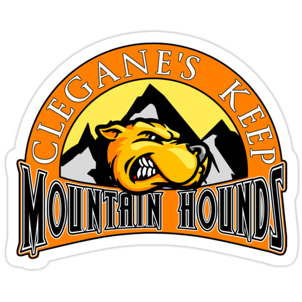
For the design I wanted to go in a different direction because the obvious problem was calling the team “Clegane’s Keep Cleganes”.  A friend stepped in and said that I did need to do this one and offered the idea of the Mountain Hounds as a sort of compromise.   That made it all the more easy to realize the design in full.

I tried to keep the  overall color scheme intact, though had to fudge a bit since the contrast of a dark focal point on a lighter background was muddying the design.  The text part was easy as I had no real basis for inspiration.  It did remind me of a racing team or a logo for a outdoorsy type store or brand, maybe even a beer.

The Clegane’s Keep Mountain Hands is available from my stores in the following:

The Clegane's Keep Mountain Hounds
Available on Redbubble and Skreened


American Apparel Lemon Unisex Fitted T-Shirt
from
Skreened: $29.99


Light Yellow T-Shirt from Redbubble: $24.54


White Hoodie from Redbubble: $43.20

Sticker from Redbubble: $2.40


iPhone 4S/4 Deflector Case from Redbubble: $37.20

You can check out all of the Westeros League designs at Skreened and Redbubble.

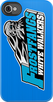
The Westeros League: The Frostfangs White Walkers

Posted by Mongo

Rounding out the 12 main teams, I knew I had to include the White Walkers.  Question was… where do they reside?  I scoured over the Wiki of Ice and Fire and debated the idea, nearly scrapping it altogether.   I was going with Always Winter but was swayed by a good friend to use Frostfangs.
This was the one design where I really broke convention like the Night’s Watch Raiders.  I wanted to keep to a city and house name but having only seen the two seasons and not read any of the books, I was a bit lost in the Haunted Forest.

I finally settled on Frostfangs White Walkers.   I’ll admit the name didn’t roll off the tongue but thought if I could pull it off, it would be well received.  I’ll leave the judgment to you all.

In coming up with the design, I wanted to do something different with the colors.  I already had a lot of silvers, grays, blacks, to go along with whites.  I knew that white was going to be a central color but had to offset the color somehow.  Grey was inevitable but what about another color.   The Rangers’ crow had those red eyes.  That was it… that frozen blue look in the eyes of the Others.  That was third color.  I tried to make it look like one of those arctic blue cough drops. 

Next was the hard part… the actual look of the design.  I did some searching and figured I needed something that looked like a soldier, pretty much a dead soldier, though.  I figured something akin to a Civil War style look.    It seems rather strange, but think of the leader of the Others as an old civil war soldier or mountain man.  That led me to a college team in West Virginia, the Appalachian Mountaineers. 

Its design was exactly where I was going in terms of ideas.  It had that ghostly man with a beard set against a mountain.   However, I knew that I needed to be more cracked and rigid with the lines as the leader of the Others had that very wrinkled and lined face.  So, I redrew the design, using the Mountaineers as a basis, but made the face hatless, more angular, added in some lines to the beard, and then expanded the mountains more to adapt to a hatless, nearly bald head. 

As I’ve found out over time, fonts for logos are rarely created, taking into account all the letters. In this case, no one font worked totally for all the letters in Frostfangs White Walkers, so I had to customize a few to capture the same feel as the Mountaineers logo.  The easiest part, considering the rest of the design, was the side wall of the team name.  In the Mountaineers logo, the "N" and "S" have breaks in the gray.  I decided to go solid, unlike the "S" in Tullys because it just looked better. 

When all was said and done I was proud of the work... it's still not 100% where I would have liked it, but I'm not going back and putting walkie talkies in over top of the guns. 

And with that, here's The Frostfangs White Walkers.

The Frostfangs White Walkers
Available from Skreened and Redbubble

Navy Anvil Unisex T-Shirt from Skreened: $25.99

Grey T-Shirt from Redbubble: $24.54


Dark Blue Hoodie from Redbubble: $47.40

Sticker from Redbubble: $2.40

iPhone 4S/4 Deflector Case from Redbubble: $37.20

As always, you can check out the entire line of designs at my Redbubble and Skreened stores.

Footnote:  Here's the original inspiration for the design.  I've began putting this at the end because when I post it to Facebook, it tends to pull the first picture which is usually an actual sports team logo... ruining the effect of sharing the post.


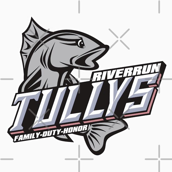
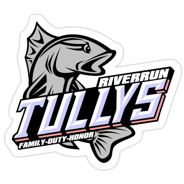
The Westeros League: Riverrun Tullys

Posted by Mongo

Chugging right along in the Westeros League designs.  Next up... The Tullys of Riverrun.

Watch my Design It Video for
The Riverrun Tullys

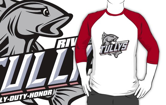
For this one, I also wanted to stay away from well known professional teams.  The easy way out would be to look at the old Miami Marlins logo from when they were still called The Florida Marlins.  I did look to them for inspiration but didn’t feel like it would work as a design style.  I wanted to go more minor league with this idea.  So… I started doing searches on minor league logos with fish or nautical mascots when I came across the Columbus Catfish.


I liked how the fish called curled around the name.  I also liked how the team name was shaded and at an angle.   I found a fish picture and then redrew it facing the opposite direction, adding an angry eye to it.  Eyes are hard to do.  I’ve had a few designs that were crippled by the idea of having angry eyes attached to them.  Case in point, the Iron Island GreyJoys.  That Kraken was Cray with those eyes in the early stages.

After I finished up playing with the fish, I got started on the name.   That became another nightmare.  Here’s a little tip for you folks looking to do pop culture sport logos.  More often than not, the font style for a team name is custom.  Someone might come along and develop a font based on it, but for the most part, the customization is meant to encompass only the characters in the logo.  The rest of the alphabet isn’t usually a consideration.  So, when I looked at how the 3D visualization of the word “Catfish” had all solid bottom lettering, with very few gaps, I didn’t take into account that I had a “Y” in Tullys to deal with from a spatial perspective.  As it is, the fin of the catfish covers the bottoms of the “F” and “I” reconcile this problem.  I didn’t want to cover the “LY” in Tully because it’s not like we are familiar with a Tully like we are a catfish.  You can lose whole letters in catfish and know what the word is supposed to be just by association.  Also, the side of the S was hard because there is a break between the top half and the bottom.  I made several attempts at either splitting them or combining them.  That’s another thing I find hard.  It takes a real good eye to make three dimensional designs on a two dimensional plane.   I’m just getting the hang of it and still find it extremely difficult.

Now there are fonts like Chisel, Stowe Open Face , or Wednesday Matinee Shadow that sort of give you the triangular shaped letters with shading on one side, but again, the letters in these types of designs are usually customized for just those letters.  Catfish only shares two letters with Tullys, leaving me to figure out how to do a “Y“.  For the colors, I kept the silver color for the trout and let the red and blue play out in the lettering.  The blue was an easy match for the shadow of the lettering while the red became the sides of the letters which sort of matches the inspiring design of the Columbus Catfish.  I didn’t bother with the points at the middles of the letters because of the “L” and “Y” in Tullys making it more like a hybrid of the Spartan and Wednesday Matinee Shadow font types.  Probably the easiest part was the city and motto.  

In all, I think it’s one of my better looking designs.  I think it stands out as one of the best of all 14.    

You can check out my stores to see the Riverrun Tullys gear:

The Riverrun Tullys
Available from Skreened and Redbubble


Unisex Baseball Shirt from Skreened: $30.99


Baseball Style 3/4 Sleeve Shirt from Redbubble: $27.54


Dark Blue Hoodie from Redbubble: $47.40

Sticker from Redbubble: $2.40


iPhone 4S/4 Deflector Case
from
Redbubble: $37.20


See all of the Westeros League designs at Skreened and Redbubble.


The Westeros League: The Eyrie Arryns

Posted by Mongo

Next up for the Westeros League is The Eyrie Arryns


Watch my Design It Video for
The Eyrie Arryns


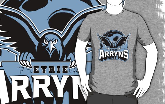
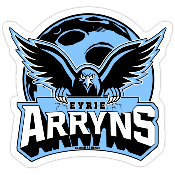
The obvious comparison to a major league American team would be either The Philadelphia Eagles or the Atlanta Falcons.  I did work off of a mix of the Eagles curvature with the MSU Spartans style of lettering.  I redrew a falcon pic, I had found, which was rather small in comparison. Now, I know what you're thinking.  "He done screwed up with this one. It's a blue falcon on a white moon"  And... you could be right.  However, I tried very hard to stick to the original colors from the House Arryn page on the Wiki of Ice and Fire.  The white moon was just not working with the overall design. 
Compare the test on the left and the finished on the right.
 
I needed the blue outline around the falcon and the signage didn't work with it intersecting, overwriting, etc.  So, I opted to go back to the blue moon and deal with it.  It was a late night and I was just too tired to go back and redo it.
Now, what do about the wording?  Where does it go?   I need to fit a moon and the falcon on the design as well as the name.  I tried putting the "Arryns" above the falcon, but that didn't leave a lot of visible background for the full moon.  So, I opted to place it below and have the falcon claw into the sign.  Even with the blue moon, I'm still a little bit perturbed with the way the outline around the wings falls behind the sign while the talons fall in front of it.  I had to duplicate the layer with the bird above and below the one with the sign so I could erase out the rest of the falcon that would be sitting behind the sign.
Overall, I'm about 75% happy with the finished product.
Check out my stores to see the Eyrie Arryns gear:


The Eyrie Arryns
Available from Skreened and Redbubble
Heather Grey T-Shirt from Skreened: $24.99
Heather GreyT-Shirt from Redbubble: $24.54

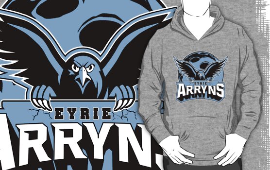
Grey Hoodie from Redbubble: $47.40
Sticker from Redbubble: $2.40
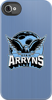
iPhone 4S/4 Deflector Case from Redbubble: $37.20

See all of the Westeros League designs at Skreened and Redbubble.

The Westeros League: The Bear Island Mormonts

Posted by Mongo

OK… new format.   Let’s roll.

Having only experienced the saga from the perspective of watching the show, I know there is a lot I’ve missed.  I also know there is a lot that is different. Season Three will probably jump the rails considerably.  However, I have tried to stay faithful to the books in terms of the designs of the various houses. Leaning heavily on A Wiki of Ice and Fire, I did some research to see how I could pull off the various themes and sigils as a sports themed logo. 


Watch my Design It Video for
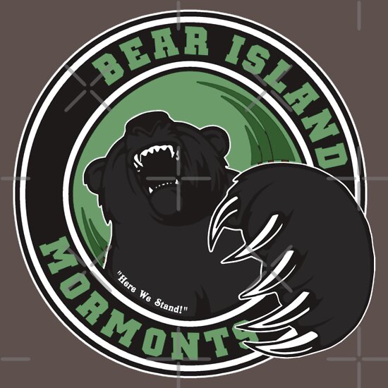
The Bear Island Mormonts

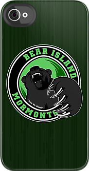
The Bear Island Mormonts was the first unfamiliar territory I broached.  Those of us “book” virgins have only been exposed to two Mormont characters.  Jorah, who is in service to Daenerys Targaryen and Jeor, his father, who serves as the Lord Commander of the Night’s Watch at the Wall.  That didn’t give me much to go on, so to  the wiki I went.

Once, I was a little more educated, I thought about how to bring the design forth.  It had to have a woodsy feel to it.  Now, there are plenty of Bears teams out there.  Of course, we all know The Chicago Bears but I didn’t see them as an influence.  There’s the Boston Bruins… but that doesn’t really have a bear in its logo.  So, I stayed away from mainstream sports.  I needed this design to be fierce… almost three dimensional.   I didn’t go really campy looking designs much yet.  Even the Greyjoys was played seriously as you can with a Kraken for a mascot.

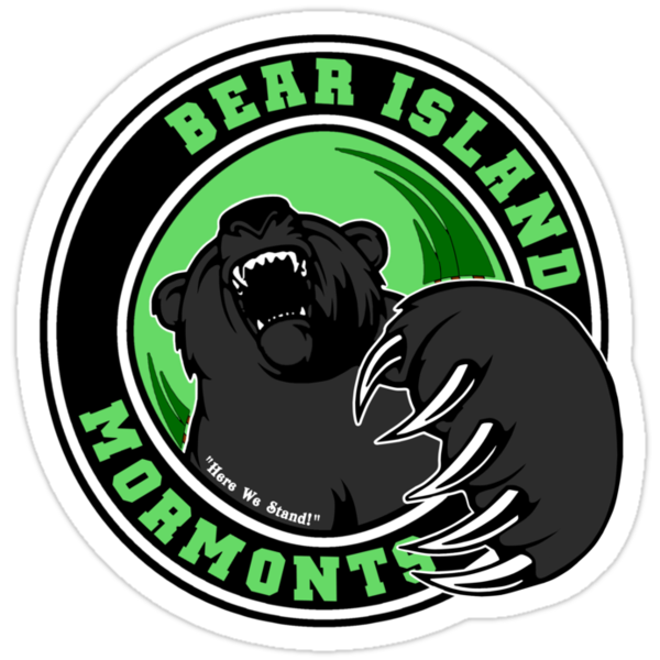
I looked around at bear logos and bear drawings and redrew from a design I saw that really captured the feeling of being attacked.  I wanted a rounded logo but trees needed to be a part of it.   They were throwing off the lines being triangular, like pine trees are.  So, I sort of gave it a twisty look as if you are on the ground and the bear is on you.    I also included, as always, the motto, “Here We Stand”. 

From a logistical standpoint, it was better that I started out using the city name and the family name as the team instead of the animal.  Otherwise, the Bear Island Mormonts would have been the Bear Island Bears.  Yeah.. sometimes you have to plan ahead in these things or you will end up having to restart, jump the shark and change gears, or just continue going with what could end up as a bad design.  Of course I ended up having to jump the shark a bit later on with my last two designs.    I wanted to include them but thought it was going to be hard to justify the city/house name rule.  But… I think it worked out fine.  

Check out my stores to see the Bear Island Mormonts gear:


The Bear Island Mormonts
Available from Skreened and Redbubble


Heather Grey T-Shirt from Skreened: $24.99


Asphalt T-Shirt from Redbubble: $24.54


Grey Hoodie from Redbubble: $47.40

Sticker from Redbubble: $2.40


iPhone 4S/4 Deflector Case
from
Redbubble: $37.20


See all of the Westeros League designs at Skreened and Redbubble.