
First off, in order to pull off this look, you need to become familiar with layers. Layering is invaluable when it comes to applying different images or effects to a design while still maintaining the original photo separately. This way, if you screw up, you can always scrap that layer and start again fresh.
While most vintage shirts are specifically branded with something from the past, CP tends to look down on copyright infringement. If you have an original design that you would like to make appear worn out and cracked, it’s a piece of cake. Layered cake, that is.
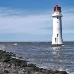
The Layers window allows you to add, duplicate, delete, flatten, and even diminish the visibility of a layer. Before we get too far ahead of yourself, let’s back up. We’ll use our lighthouse image for this example and make it look like an old photo that has been bent and crumpled all to hell.
Look for the floating window that is called Layers. If you can't find it click F7. Now, add a new layer on top of the background image by clicking on the icon that looks like some papers with a plus sign in the middle of it.
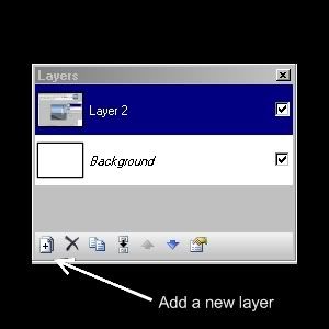
This will give you a surface in which to work without messing up your original. If you take a look at the Layers window you can see a checkbox next to some of the layers. This is showing you which layers are visible. If you uncheck it, the layer stays where it is, but it becomes hidden. You should also see that one of the layers should be a different highlighted color. This is telling you which layer you are working with at the present. Always be mindful of where you are within layers so that you don’t mark up an important one.
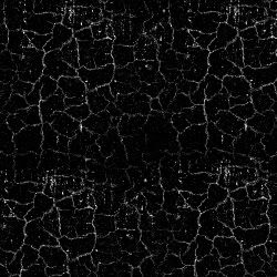
Now, you need to do some searching. Head out onto the Internet and look for some royalty free patterns. I found one that looked like some erosion had occurred on concrete. It’s personal preference, so search far and wide for that perfect royalty free image.
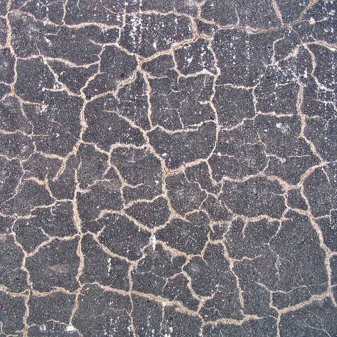
Once I had my cracked template image, I opened it in Paint.NET to manipulate it. Using Adjustments>Black and White I could remove all of the colors rendering a black and white image. Then I used Adjustments>Brightness and Contrast to remove additional unwanted parts of the image.
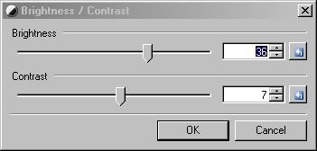
For this example, I pushed the slider for the Brightness all the way to the left and Contrast to the right. Next I used the magic wand tool which looks like a matchstick or a lollipop to lasso all of the open image that was white and cut it from the layer by pressing Ctrl-X. This left me with only the cracked lines and some speckles among the layer.
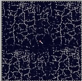
Now, here’s where we achieve the look. Use Adjustments>Invert Colors to turn all of those black lines white. If it worked out, your base image should appear to have cracks all through it like an old photograph. One last touch you may want to consider is softening up the cracks to give a natural, not pixilated appearance. That’s a simple task using Effects>Blurs>Gaussian Blur. You'll see in the below image that I inverted the colors to make it more visible.
Here’s a little tip. Depending on how much space you have for storage, I suggest keeping all of your layered images in .pdn format. The reason why I say that when you save it as a .PNG or .JPG format, you tend to flatten the layers losing the ability to change your mind.
For me, I tend to do two images for the same design. One for light color shirts and one for black or dark colors. If I keep the image in .pdn format, it makes it easier to convert it for printing on dark. I tend to use a lot of transparency in my images to allow for a variety of colored shirts without having to create multiple images to match each shirt color.
Now let’s see where the application of this effects is used in an image. Going back to our lighthouse image, we are going to make it appear cracked by adding in our template to another layer. Use the lasso/magic wand tool and click on an area where there is no lines.
Once you have all the negative space highlighted, press Ctrl-C to copy it. Now switch to the image of the lighthouse. Make sure you are working with the blank layer and paste the copied image into the layer by pressing Ctrl-V. Once the image is loaded you will now have everything but the cracked lines highlighted in this image. Switch to the layer with the lighthouse and copy it. This will capture everything but the lines that will remain blank. Switch back to the other layer and paste. At first you won't be able to tell the difference because both layers will comprise the entire image since the layer underneath will fill in the blanks that you didn't copy. Make that layer hidden and you will see the finished image.
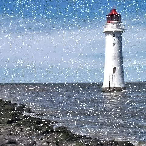
There you have it. It seems like a lot of steps, but once you get the hang of it, you can keep that cracked template on hand and use it for any image.

I am trying to follow your steps. Having trouble getting it to work. Can you help ?
Posted on August 21, 2012 at 11:31 PM
Sure.. Sorry for the late response. Let me know where you are having trouble. I just redid the steps, following the ones in the post to see that I didn't omit or screw up the instructions, and they worked.
Also, this post is 3 years old and I've learned a few new tricks since then. Check them out on the "Tips For Designers" tab.
Posted on September 13, 2012 at 8:03 AM
Post a Comment