
As a designer I am always looking for ways to improve techniques. Putting text on a design is nice, but the placement of words and the style in which they are presented is what can separate your work from others in the business. This is something I touched on in a previous post and I will veer directly from that into a totally unrelated topic…. It’s Friday, sue me. [blows kiss] Love you.
Actually, the topic I’m discussing is somewhat related. Watch me as I pull a rabbit out of my butt. The written word, or more to the point cursive writing, is somewhat out of fashion among the current generation. Beloit College released its mindset list and a lack of cursive writing skills topped their list. This means that we have moved away from hand writing everything from notes to letters to school papers and are relying solely on word processing programs, text editors, and other digital devices to get the message across. It’s kind of sad that are hands are becoming more about the tips of our fingers, clacking away at a keyboard or bouncing around a touch screen, and less about how we correctly hold a writing instrument with our whole hand.
I am the furthest thing from a luddite but it saddens me that we have moved in this direction. I find it fascinating to see relics of previous civilizations unearthed with all the mystery of their origins still unsolved. The writing and the languages lost to the ages will continue to baffle us and I wonder if our writings will end up that way. Centuries from now, archaeologists may find a tattered and torn handwritten letter and try to decipher the funny squiggles that sort of resemble the typed out language that they are currently using. Nobody will ever remember the reward of a pizza party for completing cursive writing tests in grade school. But, I will.
So, with that, I give you my ode to cursive writing.
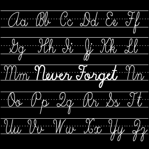
My original design was simply the words "Never Forget" in the middle of the page with the graph lines. However, it seemed somewhat obscure and didn't make much sense. Well, it may not make anymore sense, now, but I think that including the rest of the alphabet, upper and lower case, as we were always required to write them out in class, made it a little more understandable.

Post a Comment