As the cliche goes, A picture is worth a 1000 words. To a t-shirt designer, a word can be worth a thousand dollars, in sales, that is. I’m talking about font and typography. As far as the Print On Demand business goes, most of my sales are derived from funny or ironic pop culture designs. Most are a mixture of images and texts. However, I have a few designs, that aren’t really what I would call designs. They are simply words on a shirt. But putting funny phrases on a shirt is nothing new or secretive. In fact, Thinkgeek has a simple black shirt with the word “meh” on it and it’s pretty funny because it hits that chord of discord among geeks and the younger, texting and Internet savvy generation.
Truth is, you don’t have to have a flashy, artsy-fartsy design to make a sale. Yeah, you may want it if you are indeed an artist, you may need it for credibility’s sake and if you have those kind of skills, I applaud you. If you don’t, you have to go with what works. For me, I have a novice to medium amount of artistry skills which could rival a third grader’s macaroni art. My success with selling graphical tees is a product of paint program trickery. But, I’ve also complimented those designs with a slew of text designs to help out in the balance sheet.
Don't get excited just yet. You may have the funniest g’dam sense of humor in the world and can bring the entire room to tears with a simple utterance of a word like, "Bazinga," but there is no voice attached to your shirt. Just like telling a joke, it’s all in the delivery. That’s why you need to really think about how to properly put words on a shirt.
First off, know your typefaces. There are more than 1001 fonts out there and if you use them correctly, you could have a great seller on your hands. If you think Comic Sans is the end all, be all of fonts, to use on a shirt, you could get the oversized hook, yanking you off the stage. Study up on typography and see how attention to typograpgy can make your words jump off the page, or shirt as it were. Choosing a font or style of font is part of the battle. What about the letters themselves? Is it something that looks better in all caps or does it need to have some distinction between the beginning and the rest of the word? Maybe your text reads well in all caps but would look better if you made the first letter bigger. If you can't come up with your own fonts, you can find a slew of them on the Interent. Some free. Some for money. But before you start loading up your font folder on your computer do you have the right to use those fonts for commercial purposes? People who come up with font designs are very talented and you should respect their work by reading all the fine print.
Second of all, a word, by itself, is nice, but if you can do some extra trickery to it, it might become more interesting of a design. Now you're thinking, "Ok, wait a minute. we’ve stepped away from just working with text and are getting into designing, right?" Not necessarily. Just look at the text on your design and think if there are any other touches you could use that would help set you apart from the other designers out there. Open up an application like Microsoft Word and try WordArt to give you some definition or diversity. Look at your Graphic Editing Application like Photoshop or Paint.Net to see what features they have for text on a design. Maybe some shadows or three dimensional use helps. What about arching the text or slanting it or think of other ways to display the word. Then again, it just might look good sitting there in the middle of the shirt like “meh.” In any case, never be satisfied with a design until you’ve given other options a chance. Don't get wrapped around the axle, though, because sometimes less is more. Still, when you go with style over substance, you usually win in the end.
Also, throw a splash of some other elements into the design. Creating a picture out of words could be nice or maybe you could add some touches to your font to make it look aged or different. Outlines and gradients can also help. For me, black text on a shirt is ok, but if you really want someone to read your shirt, simple words will not grab their attention. The same goes for people buying your shirts.
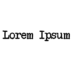
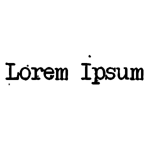
I personally like typewriter fonts. One of my personal favorites instances of a typewriter font in use is Cheap Trick. Their album covers have that sort of bleeding edge look where the ink kind of runs on the page. But typewriter fonts are a little over done in shirt designs so I like to add some other elements like droplets of ink or smudges to the page. It’s a fairly simple, or Cheap Trick [wink, finger guns, mouth clicking] And doesn't take that long to do. Take a look at the two images below.


This is just one example of how to experiment with your designs. You are only limited by your imagination. Chances are your simple word or phrase would probably sell on its own, but when one or more other designers are already established with similar looking images, you need to set yourself apart. It may be the difference between their single word on a shirt or your flashy design that happens to look like a word. In any case, you gain experience, ability, more importantly, sales.
Font on!
Font and Typography Websites
1001 Fonts
Dafont
Fontspace
Peer Links
250 Beautiful Typography Shirts


Post a Comment